
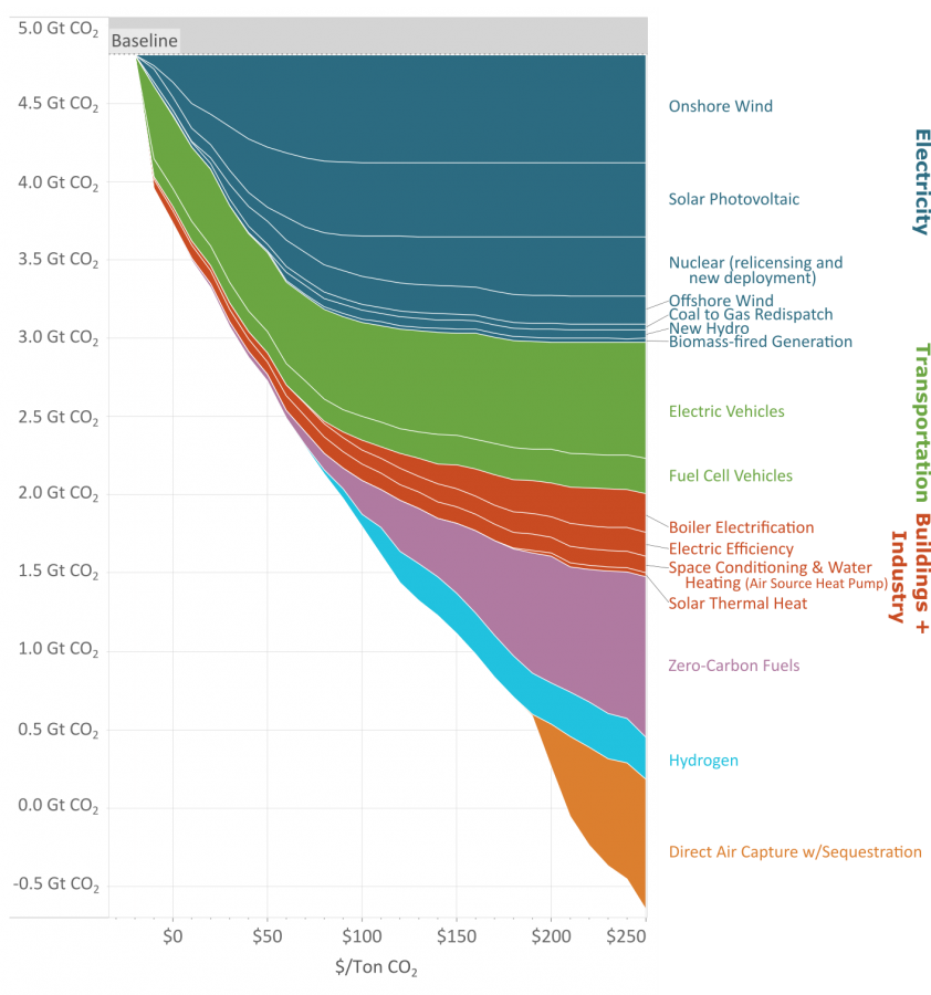
As you reduce the amount of carbon emissions (the y axis) the methods to keep reducing carbon cost more (the x axis.)
This great graph came to my attention from this video from vlogbrothers. It also has some good explanations of what it means.
Note that carbon capture doesn’t really make sense till you’ve exhausted all the other emission minimizing methods.
Source: https://www.edf.org/revamped-cost-curve-reaching-net-zero-emissions
But is it? Does it?
No it doesn’t, not the way this is being presented. The axis need to be relabeled and rearranged to represent that. Just accept that this is a poor presentation of these data.
The y axis is the global co2 emissions. Where are you getting that it isn’t?
Lol.
No it isnt.
Average annual emissions are 10gt per year right now.
Y here is ‘cumulative’ carbon offset capacity (which is a bit of a misnomer because in their method you ‘stop’ doing things that are ‘cheaper’ at lower cost per unit carbon, which is like, not a good assumption to make, but we’ll stick with it for just trudging through this disaster of a figure).
This is why data presentation matters. People who don’t know what they are talking about or how to understand these things will make the wrong conclusions.
Hmm actually looks like this is only the US. The 5gt is from 2021 when it was published. Yeah that should have been more clear.