
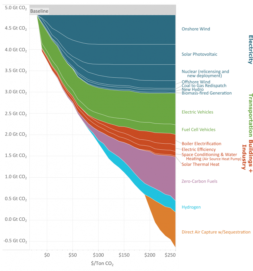
As you reduce the amount of carbon emissions (the y axis) the methods to keep reducing carbon cost more (the x axis.)
This great graph came to my attention from this video from vlogbrothers. It also has some good explanations of what it means.
Note that carbon capture doesn’t really make sense till you’ve exhausted all the other emission minimizing methods.
Source: https://www.edf.org/revamped-cost-curve-reaching-net-zero-emissions
Why would the logs be emitting CO2 (rotting?) if they are alive and growing?
Because they’re only alive and growing till they die and rot. Sometimes trees do both at the same time, rot from the inside out. You can’t just plant trees for carbon capture, you also need to deal with how to permanently sequester the carbon.
Let’s say that for millions of years a healthy biosphere grew around forests and the balance worked. Now you come to tell us it doesn’t. Wouldn’t you think it’s a bit unconvincing?
We’ve only been pumping out co2 for a hundred or two years. We can’t keep doing that and expect the old balance to hold up.