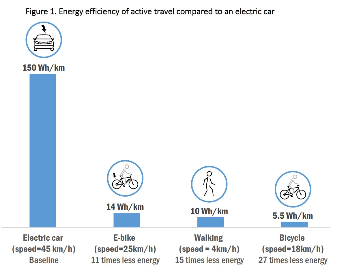
Of course. But the way it is plotted now also gives a false sense of energy economy.
Maybe there’s another way to compare the data.
An energy-speed plot with multiple curves for the different vehicles comes to mind. Then simply stop plotting that curve when that vehicle is outside of its speed range.
I’m not contesting the notion that the plot is trying to convey; just that it’s not really the right format for visualizing this data.