
Hi all,
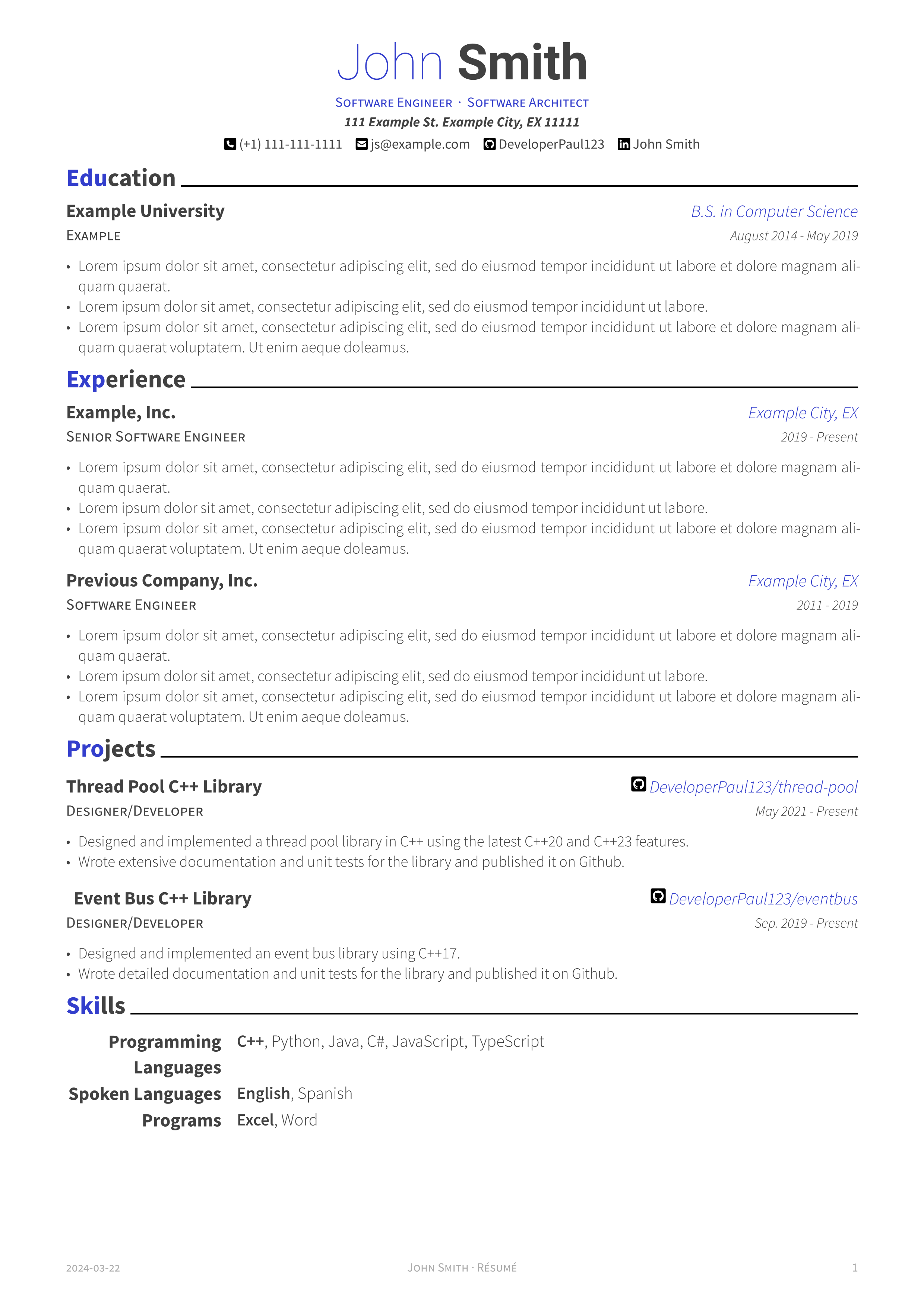
I made this typst template originally to port my personal resume to typst from Latex. It tries to be a faithful port of the Awesome-CV latex template that I was previously using. Hope you find it useful.
https://github.com/DeveloperPaul123/modern-cv
Edit: added missing link
I’m working on some of the changes your suggested. Here are screenshots of the adjustments. I’m curious to hear your thoughts. Thanks!
Here is a monochrome version without colored headers. I also adjusted the default accent color, but this is user configurable as well.
It looks a lot cleaner now.
The body text seems too light still, but that might be my phone screen. It should be solid black.
OnlyOne change from here I would strongly recommend making is the blue “city” text black.Treat blue and bold text as your ‘highlighter’, there to help someone quickly navigate to the important sections of the page. City is not important. Your use of varriying font sizes and bullet lists is great for page navigation.
If I was going to use color, I’d highlight the jobs before the city name/git link.
The rest is personal taste.
Personally, I think the blue headers is enough. It might get to too blue if you color job titles as well. You don’t need a separate monochrome version, the dark blue will show as black if it happens to be printed in B&W. You should also test print your resume in B&W. I find easier to spot errors on paper.
Edits as I spot more little things.
(Also there’s an extra space in the second skill name - Event Bus)
(You also have space to make programming languages one line. At first glace I though you had a blank section for “languages”. Could probably just say “programming”, but I’m not in that field so maybe that’s frowned upon?)
(In education, you have an example line underneath the university name, what is that line for? I would put the degree in that space, not off to the side. That’s technicaly more important that the university it self, but it’s probably “improper form” to list that above the uni name. (or whatever some one snoby would say).
(One last thing, you don’t really need your full street address. Its unlikely anyone will mail you a response, and its just as likely you’ll have to enter it into the application form anyways. City will suffice.)
(One last last thing, if you’re going to give yourself titles at the top, you better show them in your expirence section. (I know this is just an example template and I am being incredibly picky) but I don’t see architect anyware in the actual resume. That communicates to me you’re just calling yourself related titles hoping one sticks)