

I’ve been working on an alternative web UI for Lemmy for a couple weeks now and it’s got enough features I wanted to share it. I love that somehow people have found it despite me never having posted online about it until now (until a couple days ago it was called sx-lemmy, sx being an abbreviation of my username) so you might have seen it in a list already.
Alexandrite is a (for the moment) desktop-first Lemmy interface, I primarily use Lemmy on my computer and I wanted a more convenient way to view posts and comments without juggling tabs or losing my place in the feed (with infinite scrolling). It’s still very much in beta, and I have a lot of work to do still, but it’s got most of the basic features.
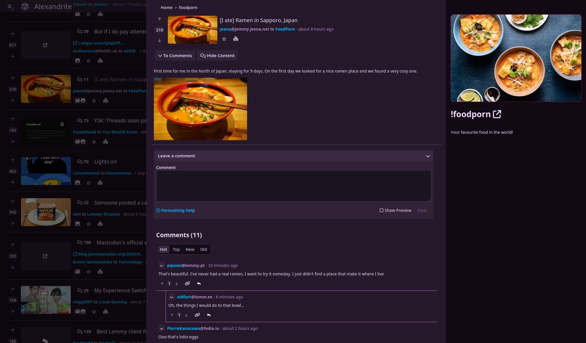
You can view a post and comments in an overlay without losing where you scrolled to:
A non-exhaustive list of things you can do:
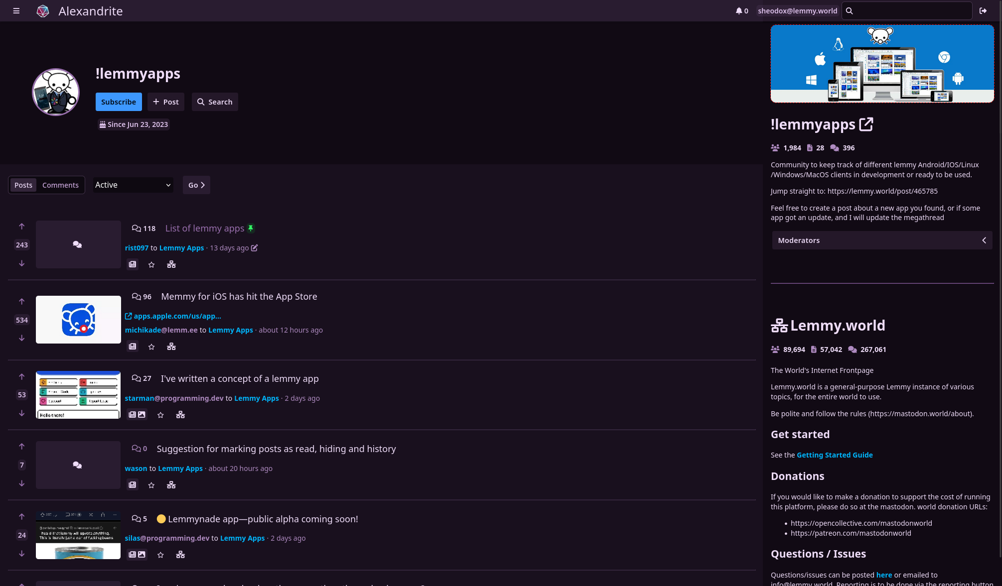
- view home/community/user/communities feeds
- post/comment
- subscribe to communities
- vote
- save posts
- search
- inbox stuff
Noteworthy missing features:
- reporting
- blocking users/communities
- mod tools
- image uploading
- automatic linkifying of urls/communities/users in comments/posts
For those who care, it’s all Sveltekit which is a dream to work with. Alexandrite is the name of the kind of gem in my wife’s wedding ring, it looks cool and changes color in the light.
I love having alternative desktop-first interfaces! Really appreciate you putting the time in to make this.
A couple hopefully constructive thoughts:
I find the text a little bit hard to read. It’s like the text is lightly purple on top of being on a purple background. Maybe one gets used to this over time.
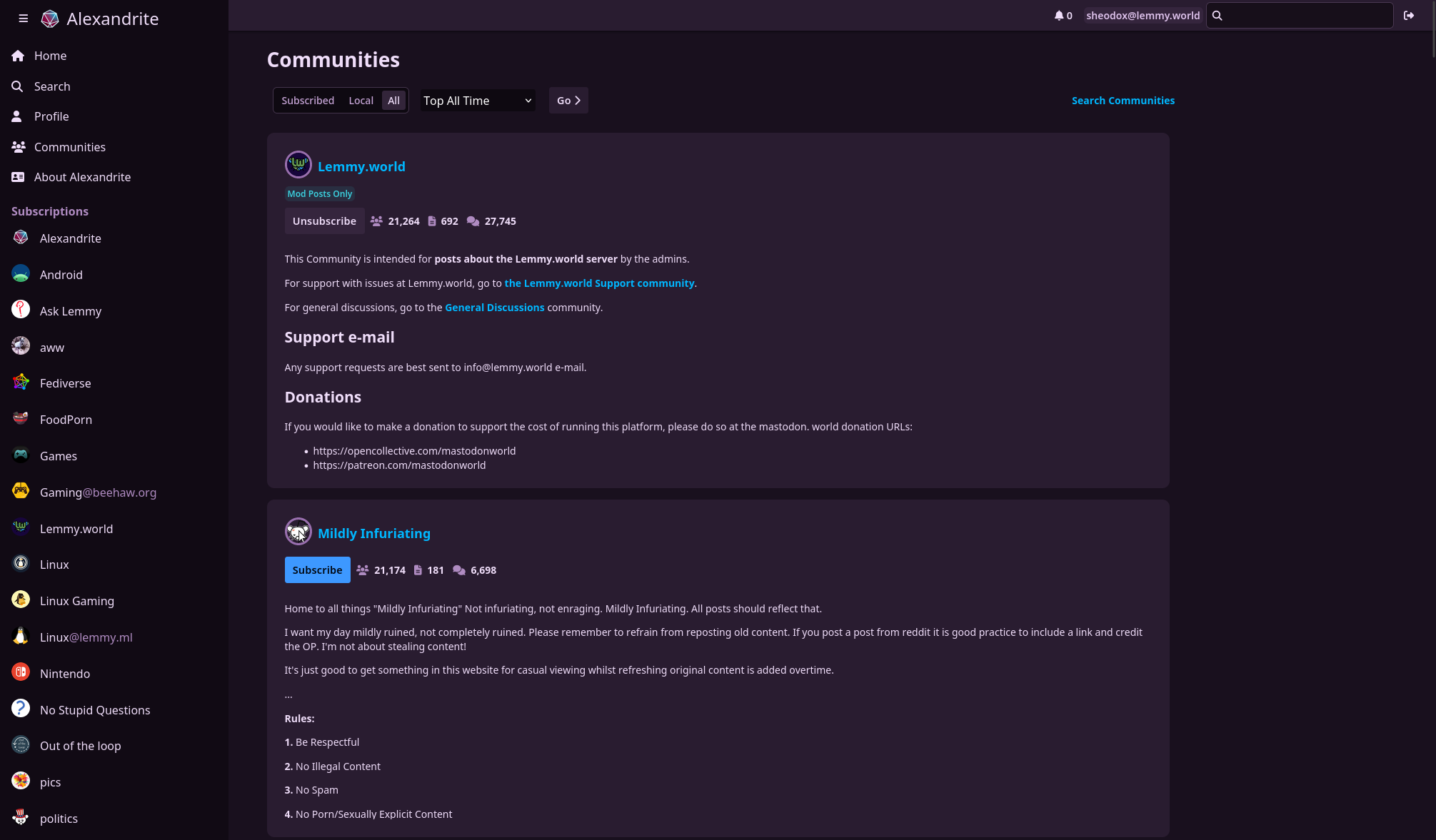
Why the decision to not show profile pictures and community icons without hovering over them? It makes it much easier for me to identify what community content is coming from at a glance when those are present.
There are now images next to users/communities on posts, let me know what you think.
Great improvement in my opinion, thanks for the quick turnaround!
I like it too, great suggestion!
deleted by creator
Thanks!
Which text are you referring to? The normal text color is very slightly tinted purple but still has a pretty solid contrast ratio. Or are you talking about the text color on posts you’ve viewed already? I know certain kinds of screens don’t render color very accurately, maybe I’ll have to try it out on some other monitors around the house.
I thought having images big enough to recognize looked messy to me the way it’s done on the official Lemmy UI (at least on 0.17.4) and I hadn’t really tried making it look good. I know what you mean though, I might try showing the images (but at about the same height as the text) and see how that looks.