
…or is that “Sign of The Helvetica Neue?”
I’ve been trying not to mention it since yesterday, actually since I saw the mockups weeks ago, but I can no longer stay silent. And I’m hoping you all can’t stay silent either.
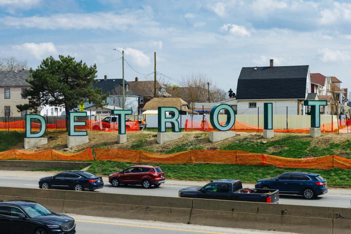
The D-E-T-R-O-I-T sign on eastbound I-94 stinks. That is what design by committee looks like. That sign falls squarely in the “My Kid Could Do That” category. Where the Avatar logo designer at least skimmed through the font list, whoever’s nephew “designed” this sign just went “Helvetica Neue Bold”…aaaaaaand done. No neurons were harmed, much less awakened, in creating this outdoor sign. At least whoever’s responsible didn’t pick Arial.
I’m not even going to mention that green outline.
Tell me, from what hotel did they steal those letters from?
Okay, !detroit. Your turn. Go on. Tell me I’m wrong. Tell me I’m right. Tell me what you think about this horribly bland, imagination-less outdoor signage, a tribute to nothing.
The nicest thing I can say about this is that it’s better than Sterling Heights’s Golden Butthole.
Call-Me-Argumentative-If-You-Must Dept.:
In defense of Metz’s subsequently-named “The Halo,” well, the snide will be snidely. The giant ring recalls nothing of an anus except to all who have their heads firmly entrenched in one, usually their own.
On the contrary, while “The Halo” still more “creative” and dynamic than Detroit’s plastic letters
robbedrepurposed from disused motels, it’s something that Project Mayhem would have sabotaged.