
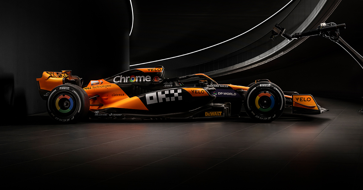
Easily identifiable and not completely hideous, mission accomplished. As a general critique I’d like to see less Chrome and more chrome.
I actually don’t hate this one. Major improvement over last year imo
Agreed. Last year’s I thought looked atrocious, this one is pretty good I think. Still not loving the Chrome logo stuff, but what can you do.
I think it was the Teal for me last year, it just clashed horribly with the orange.
The chrome wheels at least look pretty decent in motion. Definitely super ugly stationary though
Yeah, and with the the Chrome logo. It was all clashing last year, pretty much.
The chrome is part of their history from a period when their livery was all chrome. Also both Lando Norris and Oscar piastri like the chrome livery the most.
Are you talking about the chrome Vodafone livery? That one is an all-timer, I love it. I was referring to the multi-colored Google Chrome logo from one of their sponsorships, however.
Oh shit I didn’t even realize. Yeah the chrome logo doesn’t really fit the design… Does look kinda cool when it’s moving though
Did you mean chrome or did you mean Chrome?
The number is illegible lol
I didn’t even realise it was supposed to be a number at first
What are the FIA’s rules on number legibility? Or Formula 1’s?
I remember a few years ago some team had to change theirs to be more legible
Yeah so this livery is almost certainly illegal then. Oops.
That it is
Hopefully the T-Cam will be easy enough to distinguish them