You must log in or register to comment.
Both features looks pretty neat and are something I’m really looking forward to. Now if we could also get a (non hologram?) UI that’s actually readable on light backgrounds that would be great.
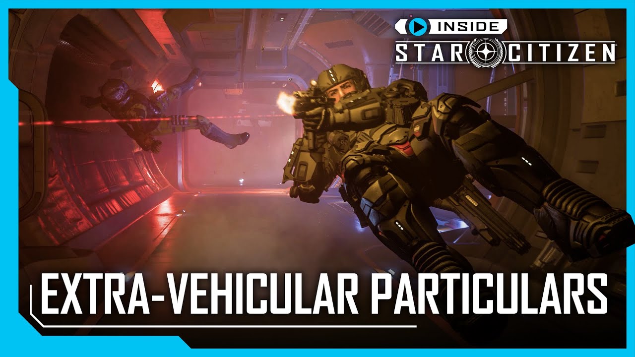
I like the new EVA, but I don’t like the idea of completely dropping the old. As the main movement pose it just doesn’t make sense ergonomically, needing your face turned basically 90deg from its natural position. It also makes you look like you’re moving through any regular old fluid instead of space. I would hope they add a toggle using something like the prone key
Those pilots will have one hell of a sprained neck after each space walk.


