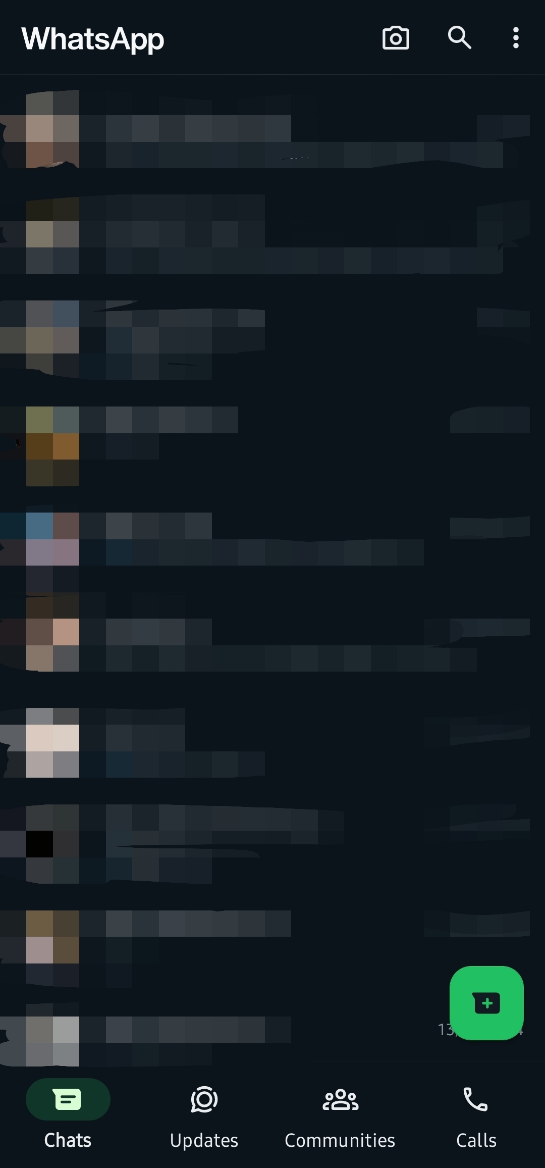
I’m not in the beta, and this is what my WhatsApp looks like now. This might be old news, but until today I had the green UI.
(Sorry for the crappy censor job. I wish Android had a blur feature built-in)
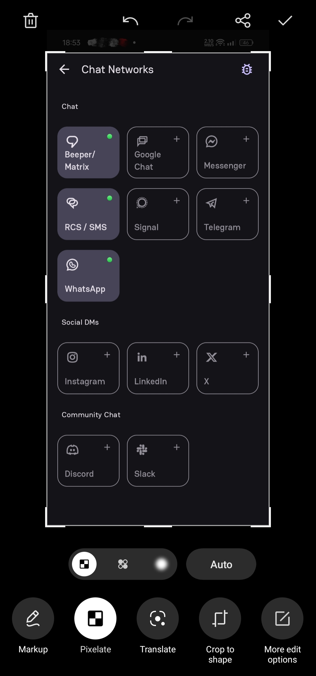
You can use a 3rd party app like a beeper. It has connections for apps like WhatsApp, telegram, Google Messages, slack, etc. As for the blur tool. At least smartphones based on colorOS like RealmeUI have it in the built-in gallery app.
deleted by creator
Needs more material 3
the design has been iOS-ified from a couple of weeks
I’ve seen people fly into a frenzied rage over this, but I think it looks better.
I think the neon green accents is a little too much and it should instead go with the same green as the logo, though.
huh I got a new layout today but it has AI features in the search? I don’t like it. I switched to signal and forced everyone but a stubborn few to follow.
old news
Not for me :)
deleted by creator
Yep. Same thing here. I got an update and the dark mode has changed in looks as well. I feel the green colour needs to be toned down a bit tbh.
