• @RGB3x3
    link
    English
    105 months ago

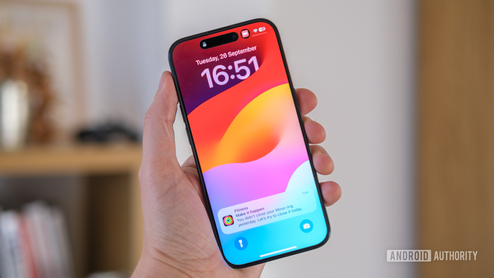
    Moving that information to the bottom of the screen sucks. Why would they have information where your hands typically hold the phone? People’s eyes typically stay focused toward the upper-middle of the device, so being on the bottom just makes it harder to read.

    • @[email protected]
      link
      fedilink
      English
      45 months ago

      It’s so dumb. Android has always had better lock screens and widgets and now they want to copy iOS

      • @[email protected]
        link
        fedilink
        English
        25 months ago

        Starting to see this is the auto industry and EVs where they copy all the dumb shit Tesla does.

  • @[email protected]
    link
    fedilink
    English
    55 months ago

    Google has zero shame. They made that abundantly clear when they moved the gallery button to the opposite side in the camera to match Apple (a distinct feature in an otherwise identical and shitty camera app).