The app icon looks much less polished than the app itself. How about we change that?
One of the great traditions of FOSS is its refusal to adopt that corporate visual design ethos which turns every logo into an abstract solid-colour silhouette optimised for mobile rendering. I like GIMP’s plucky rodent, for example. A counter-example would be the sad [d]evolution of the Firefox.
We can have nice design without the corporate bullshit. They aren’t the same thing.
Oh god no, please no
They have a icon contest on the main page.
That’d be great but I can’t find it! Any pointers where that’s happening?
deleted by creator
Built in to Nova Launcher too. But I just put the app in a circle and I’m happy.
Nova launcher was sadly bought last year by a Chinese data harvesting company. If you care about your digital privacy you should switch to something else.
God dammit, anything with decent feature parity?
I dumped Nova for Lawnchair. It’s not as actively developed as Nova was, but it’s a decent replacement.
Honestly I’m not sure. When they were first bought I switched briefly to one called OpenLauncher on fdroid. It’s good and similar but not actively being developed. I recently switched phones (to a Fairphone 4) and since have just been using the stock launcher that came with my phone though.
Revert to v6.2.19 and disable auto update - still works great on Android 13/One UI 5.1.
Nooo leave the cute thing
Let’s just say it, the icon sucks ass.
No! It is great!
You’re great.
You’re not half bad your self😊
can I get in on this bromance?
Always room for awesome dudes like you!
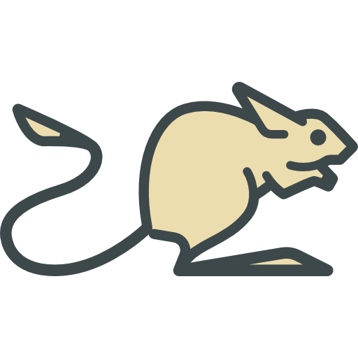
The icon has an animal which is known as ‘Jerboa’. But in Android one of the easiest tasks is to change the app icon and its name into any.
Yeah, but that won’t affect e.g. the icon of this sub.
I think every current Lemmy app for Android has a terrible icon lol
I like the icon.
Yeah something matching it’s beautiful clean UI. Like a reduced jerboa head or smth.
“Reduced jerboa head” sounds like a fancy French dish that I can’t afford to order.
Your not wrong lmao. And then you order it and get 5 grams of mice meat on a huge plate garnished with a few plants that you really can’t be sure if they are to eat or just to look at. Then you eat it for half an hour (you don’t want to gorge), leave the plants on the side just to be safe and smile at the waiter with a forced look on your face and say that everything was so wonderful. Afterwards you go to McD’s to get properly stuffed.
Hi im Mac.
Mac Suckerberg?
I’d like to see something similar to the Tusky app’s logo.
Nooooooooo. Keep the icon. It is one of the things I like best about the app! And I’m not even joking.
I’m actually working on a few right now! I’ll try and have em done by the end of today, and I’ll see if I can post em to this community
Awesome! Please share
Of course! I made a post here: https://lemmy.world/post/2002082
I just have the icons I made so far saved on a google drive folder
But yeah, like I mentioned on the post, if there’s any kind of icon you want designed, feel free to ask and I’ll see what I can whip up
nooo i love the icon :c
Change the icon is the first thing that I have thought and I tried to create one. But a jerboa is so difficult to make as a good icon :c
The logo icon is the only good thing about jerboa. I switched to Connect and haven’t looked back.

