
The Pixar lamp choosing where to strike:
The only defense are serifs
They might have helped but we’ve seen how it fared regardless
Better version:
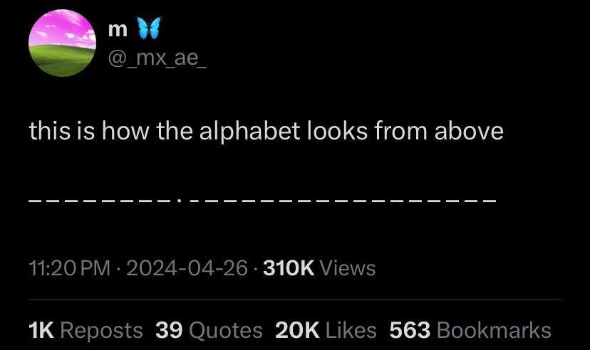
The alphabet from the front and above:
ABCDEFGHIJKLMNOPQRSTUVWXYZ
––––‒‒––·‒–‒— –––––‒–––—––‒This corresponds almost perfectly with Roboto on my Android phone. Characters featured:
U+00B7· MIDDLE DOT (I)U+2012‒ FIGURE DASH (EFJLSZ)U+2013– EN DASH (ABCDGHKNOPQRTUVXY)U+2014— EM DASH (MW)U+200AHAIR SPACE (put in the middle cuz M&W are too wide for any dash)
This was my first thought, thanks for doing it.
It drives me mad that the em dash isn’t the width of the M!
M and W should be wider than the rest, shouldn’t they?
Maybe it’s a monospaced font
The i says otherwise.
That’s not how monospaced fonts work
Then the “i” would likely be a dash too
𝚒𝙸
em dash to the rescue! —
Not if it’s allegorical
Nor if they are all the same letter or same size letters
I and J are already different
And from the side:
|
And the other side.
ZYXWVUTƧЯϘᕋOИM⅃ꓘႱIHӘᖷƎꓷƆꓭA
| | | | | | | | i | | | l | | | | | | | | | | | | | |
Where is j?
I feel like I’ve seen this post on lemmy like 50 times over the last few days
Ah, damn. Somehow I must have missed it.
First time I’m seeing it!


