New GNOME dialog on the right:

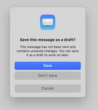
Apple’s dialog:
They say GNOME isn’t a copy of macOS but with time it has been getting really close. I don’t think this is a bad thing however they should just admit it and then put some real effort into cloning macOS instead of the crap they’re making right now.
Here’s the thing: Apple’s design you’ll find that they carefully included an extra margin between the “Don’t Save” and “Cancel” buttons. This avoid accidental clicks on the wrong button so that people don’t lose their work when they just want to click “Cancel”.
So much for the GNOME, vision and their expert usability team :P
I hope they continue learning lessons from other OSes.
I’m feeling like you are wrong about them outright copying. Some good things can be taken from macOS and Windows. But a lot of bad things too, which is why they are thinking it through.
Please do not reduce the community effort to “cloning macOS”. It’s insulting to the people working on it… Apple doesn’t own modals or modal design.
Here there are not 20 ways of putting 3 buttons in a modal. They just happen to choose a way that will also work on mobile I guess.
Kudos for noticing this extra space which could enhance these kind of modals though.
I don’t like everything Gnome has been doing, especially with the lack of customization or the status bar. But Gnome has been my go to for 7+ years and I like where it is going. Extensions are pretty fly too 👌
Sometimes when you get UI experts and users and engineers in the same room they iterate to similar outcomes because its the logical conclusion. Apples design in this case isn’t ground breaking or even original.
If multiple species of jumping spider can independently evolve the ability to see red from different branches of their family tree, multiple dev teams can come to the same conclusion about what is more comfortable for reaching with consideration for left and right handed people on various types of screens.
The problem is so scoped these days, its fairly logical for UIs to come to the same outcome.
Please do not reduce the community effort to “cloning macOS”. It’s insulting to the people working on it…
Well, it’s insulting for people to lose their work because someone did a lousy UX job. :)
Cloning macOS should not be views as something “bad” because for what’s worth we all know Apple spends a LOT in usability research (they’re not as good as they used to be, but still better than the rest).
Kudos for noticing this extra space which could enhance these kind of modals though.
That’s the thing, I’ve basic design / UX training and all the literature on action buttons with dangerous effects tells you to add a margin. Any design undergraduate should also be able to notice that life saver as well… however the GNOME team totally missed it.
This isn’t the first time them failing at basic UX and they don’t like when people try to suggest improvements nor when they later on criticize them.
Just because you like apple doens’t mean that apple does a perfect job and GNOME should copy it. GNOME does a lot of thing better than apple. And microsoft also does a couple of things better than apple. Apple isn’t perfect and microsoft isn’t all bad
Just because you like apple doens’t mean that apple does a perfect job and GNOME should copy it. GNOME does a lot of thing better than apple.
Yes, so let’s copy Apple and keep the few things GNOME does well.
Having used OS X, there is no way they’ve done usability testing. Doing basically everything is hard on OS X
This is an insane take based on absolutely nothing.
These are pretty standard UI patterns.
Your point being…?
His point is that you have no point.
My point is: if you want to copy / be inspired by others at least do it right.
So, copying is making something identical. But something that’s different would rationally be called not copying, whereas you categorize it as poor copying. Interesting.
Ever hear of two things just being similar? We are talking about a UI - these things have always followed patterns that change as usage patterns change in the industry. I think you must be young and/or inexperienced because this kind of trend goes back to the ‘80s.
But something that’s different would rationally be called not copying, whereas you categorize it as poor copying. Interesting.
I would categorize it as poor copying because the copy doesn’t conform to the design / UX patterns that were present on the “original” work.
Bro… There is but so many ways to effectively organize something basic like that jfc.
Best or standard practice, ever heard of the concept?
If it is standard design, it is not targeting iOS. That is his point.
Funny enough, I find Gnome to be more consistent and better thought than macOS… But that’s just me.
Not just you :)
It is better :)
Indeed, I freaking love GNOME’s UX/UI. But I switched to KDE for Wayland gaming.
I’m using Gnome and VRR on Wayland with no issues. AMD 7800XT.
Gnome is so much better than Mac OS
Also it is kind of insulting to call gnome a clone of something else. It is the work of thousands of people all over the globe. It isn’t trying to be a copy of anything.
It is the work of thousands of people all over the globe. It isn’t trying to be a copy of anything.
There’s a lot of ideology at play here.
Yeah you are right. It just annoys me when people call it a cheap knock off.
Who gives a shit. Use the desktop you like. Don’t post this /g/ tier bait.
I think that a lot of the recent GNOME design choices are merely because they’re trying to improve usability on mobile devices. It also just so happens that Apple is trying to make the macOS desktop closer to iOS to encourage people to move from Windows. They have similar goals, which leads to similar design choices. And all design is derivative, anyway. Who cares.
You aren’t wrong, but that has nothing to do with he issue at hand. They should copy each other if a solution is good, and that’s the issue here, GNOME forgot to copy a good UX practice that Apple actually took the time to implement.
So just use apple if you prefer apples menu layout.
This ain’t as big of an issue as you seem to think it is.
Here’s the thing: Apple’s design you’ll find that they carefully included an extra margin between the “Don’t Save” and “Cancel” buttons. This avoid accidental clicks on the wrong button so that people don’t lose their work when they just want to click “Cancel”.
And gnome has those dialogs in a different colour to achieve easily noticable differentiation between the two options
The issue there isn’t only differentiation, that well done, the issue is that an user might miss click because both buttons are close to each other.
That same logic could be applied for the save and discard button. Should there be a bigger gap between them lest somebody misclick and discard things instead of saving them¿? Atleast in the case where they accidentally click cancel instead of discard, they are not losing any data.
Hell if this really about data safety, discard/don’t save should be the isolated button because it is the only destructive option
According to the UX experts you don’t need the space between the save and discard buttons as long as the “save” is the first one. Missclick are more prone to happen from top to bottom than the other way around, so if the user wanted to hit “save” it’s more likely he will click above the button than it is to click “discard”. Same logic applied down there, when the using is looking to cancel it’s easier to missclick and hit the “discard” button than anything else.
Can you share any study for this. If this is true, it is fascinating and worth looking into in more depth
This is an application of Fitts’s law. I saw some paper referencing it to back that kind of margins on destructive actions but I don’t remember the title.
Well fitts law doesnt mention anything about asymmetrical spacing anywhere. Infact going by fitts law, the new gnome design is great because the hitboxes are pretty large
That’s what the paper was about, the law also applies the in reverse, adding the space protects the user because it makes it harder to click on the hitbox.
As someone who tried out MacOS in a VM out of curiosity I don’t find gnome to be like MacOS at all in overall functionality. I think to most people it just looks like Mac because top bar, dock and some design choices. Really though gnome is much more like Android. MacOS felt extremely clunky to use vs gnome’s fluid workspace and app switching.
deleted by creator
it just looks like Mac because top bar, dock and some design choices
Top bar, dock, system settings, activities (somewhat e mix between Apple’s mission control and launchpad), now the modal buttons, accent colors… and so many other things.
MacOS felt extremely clunky to use vs gnome’s fluid workspace and app switching.
Maybe you were running it without proper GPU acceleration and without a keyboard with actual macOS shortcuts on the function keys? Virtualizing macOS is hard and it will give you a very poor experience.
Obviously macOS has it’s defects but at least you aren’t risking losing your work due to a misclick nor you are restricted from having desktop icons like you’re on GNOME :)
dock
Not a permanent dock. Docks predate Apple any way.
activities (somewhat e mix between Apple’s mission control and launchpad
GNOME 3 was officially launched a few months after OS X Lion, but combined these things into one first.
NeXT is probably the pretty direct ancestor of osx dock. Only Apple turned it from good to bad by moving it to the bottom, where there is no space. And that only got worse as screens became wider, but not taller. And they made it overlap and obscure content and bounce around if you got near it making it extra obnoxious and hard to use.
Other docks existed even before, of course.
Not a permanent dock. Docks predate Apple any way.
The Dock comes from NeXTSTEP, the operating system Steve Jobs left Apple to develop back in 1986… GNOME was announced in 1997 so I don’t get your argument.
I’ve never lost anything because I misclicked. Ctrl+s is your friend.
See the problem there, regular users don’t Ctrl+s, they point and click.
Why would regular users need to use gnome?
No I did not have GPU accel. I’m curious what you are referring to losing work due to a misclick? Personally I don’t use desktop icons. I’m a previous i3 user so I am used to using my computer with a non traditional interface.
I’m curious what you are referring to losing work due to a misclick?
If you place “Discard” and “Cancel” next to each other, without a margin in between, is easier a user looking to click on “Cancel” to click on “Discard” and lose a document. This is more common than people think and that’s why Apple added the margin there and also why any good UX manual tells you to add a margin for destructive operations like that one.
I started on gnome. I love it at first, but as time has gone on my experience with gnome had gotten worse and worse, and my KDE experience keeps getting better. It’s a real shame because I actually tend to prefer the gnome look at feel, but KDE has been so much more usable for me in recent years.
It’s very easy to get a Gnome look and feel with Plasma nowadays.
I still don’t know why Gnome loves wasting 3 % of the screen on an empty black bar, tho.
Yeah ngl I don’t get using the entire space fore almost nothing. I use a few extensions to fill it up and make it more useful
That is true. But I have an overall better experience getting KDE to look like gnome.
That’s what I said.
Lol that is what you said. My bad. Must have read it wrong. That’s on me.
I’m kind of on the same boat you’re… however KDE tends to have issues with visual proportions and margins everywhere.
My only problem with both designs in your images is the colors. It’s a pretty standard part of UI design (in real life and on computers) that “red means cancel” and “green means continue.” Apple using blue is no big deal and I’m 90% sure they just use a user chosen “highlight color.” (Maybe Gnome as well?) But cancel or delete or similar things should probably be red or another color that signals “Stop.”
I’ve always thought Bootstrap, the web design library, has a good set of base colors. Red means danger. Light blue means info. Green means yes or success. Yellow means warning. Other buttons are a darker blue — basically the highlight color. (Not saying they chose the best version of those colors. Just that the general idea is consistency and what users most naturally expect.)
The “Save” button uses the accent color which is blue by default. With configurable accent colors coming to GNOME 47 and GTK/Libadwaita, you can choose a red accent color.
See the original description of the screenshot:
It’s now using standard button styles, fixing the long-standing issue where suggested and destructive buttons would look the same when using red accent color
It’s just an accent colour and can be changed.
Where can i change easily accent colors in Gnome without using extensions?
Accent colors are coming with GNOME 47.
Yup, i know, its just not possible atm. But thank you anyway :)
I’ve always thought Bootstrap, the web design library, has a good set of base colors
Yes it does. Those guys did a really good job.
I find that “carefully included extra margin” outrageously ugly
It’s ugly, but useful.
(unlike me, I am ugly and useless /s)
I have no idea about apple design guidelines and am not a UX designer, but wouldn’t a horizontal seperator look better? In gtk i would add one here, gives some extra space and more visual seperation.
Looks alright to me.
Same
I don’t completely disagree with you, however the cost of losing an important document because you clicked on the wrong thing is way higher than having to look at the extra space every day.
If you’re going to give GNOME shit, at least let it before how much they destroy portability of GTK, enabling cancer like Client Side Decorations, and ignoring their community when it comes to things like desktop icons.
They made GTK4 portable thanks to the gnome design being moved to Libadwaita.
Client Side Decorations, and ignoring their community when it comes to things like desktop icons.
Well I’ve complained about those a couple of time… but people always say that it’s their vision.
The founder of GNOME, Miguel de Icaza, stopped using Linux in favor of macOS in 2014 iirc. That makes me guess that the macOS design was at least acceptable to him. Maybe the visions were similar enough.
What does the founder of GNOME have to do with GNOME in 2022? He worked for Microsoft for 6 years.
https://tirania.org/blog/archive/2012/Aug-29.html
That’s definitely interesting.
Wtf… I like the layout of the old dialogue better. It is easier to read.
The older one is actually properly executed, the first button is the “Cancel” one and that makes sense because people read from left to right and tend to click mindlessly / without reading on the first button. Not sure if they actually changed the position on right to left languages but they should have…
I’ve only spent a few hours on my wife’s MacBook Pro which was still running Catalina (now Fedora) back in the days, and I didn’t think Gnome and MacOs were so similar.
To be honest I felt a bit lost on MacOs Catalina and felt like everything was difficult compared to Gnome.
But I guess Gnome is taking a lot of inspiration from the MacOs aesthetic, and it’s okay with me because it looks great.
I don’t have a lot of experience with other DE on Linux, but they lack the clean aesthetic of Gnome.
To be honest I felt a bit lost on MacOs Catalina and felt like everything was difficult compared to Gnome.
Just because you aren’t used to the macOS workflow it doesn’t mean it is bad - that’s the same argument you GNOME fan boys do with Windows users ;)
But I guess Gnome is taking a lot of inspiration from the MacOs aesthetic, and it’s okay with me because it looks great.
Yes, it’s okay, and that was never an issue in this discussion. The issue is that they didn’t took enough inspiration on basic UX patterns.
Well what I meant is that if Gnome was taking so much inspiration from MacOs, being a Gnome user, I wouldn’t have felt lost on MacOS.
I also don’t mind Gnome taking what’s great from every other OS, as it’d clearly be stupid not to if an idea is great.
I also think that people should be more open minded about what others are enjoying. I prefer Linux, but I can also understand that some people just want to have the most compatible OS with everything, aka Windows. Or the best ecosystem, aka Apple.
It is not my choice, and I’m trying to convince people to switch to something else, but just badmouthing their choice when it has objectively some advantages isn’t gonna help.