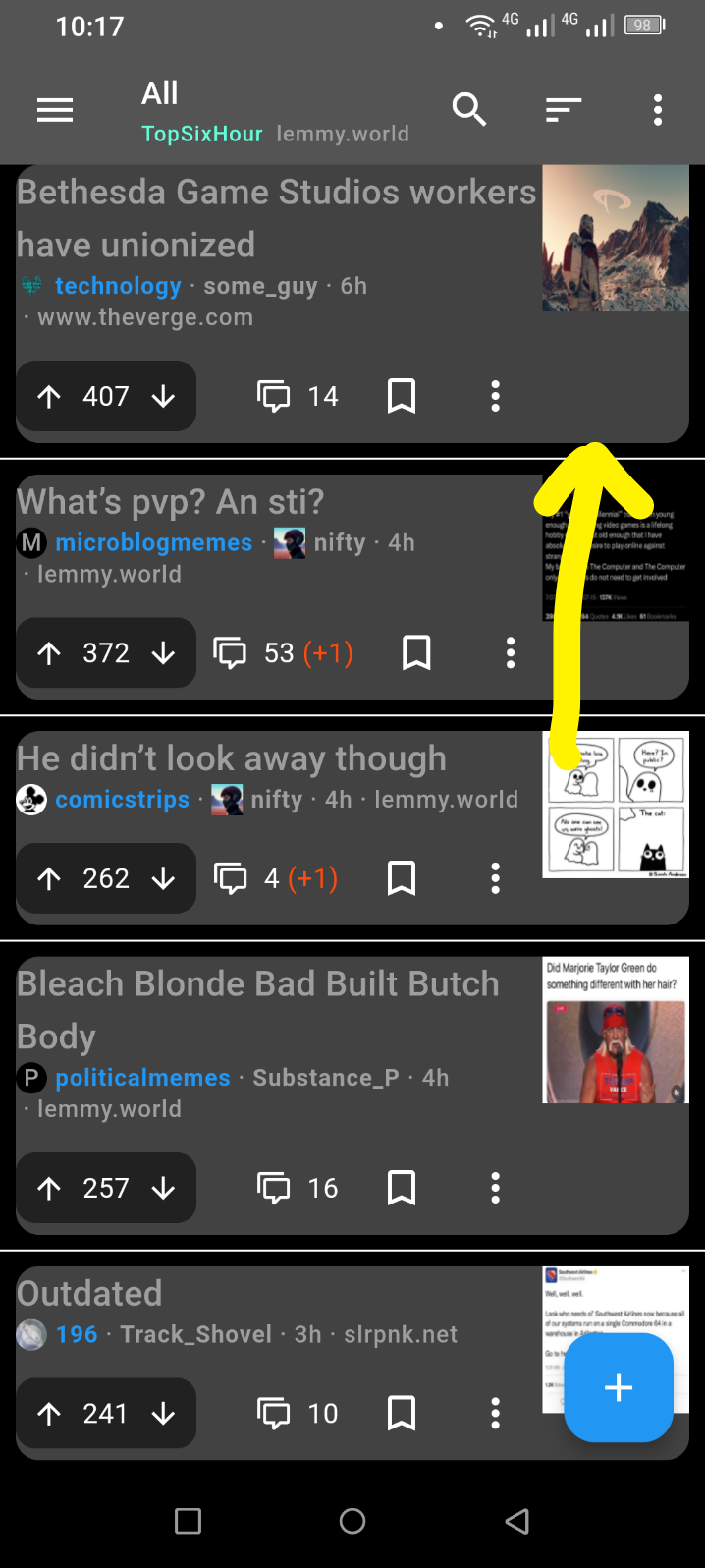
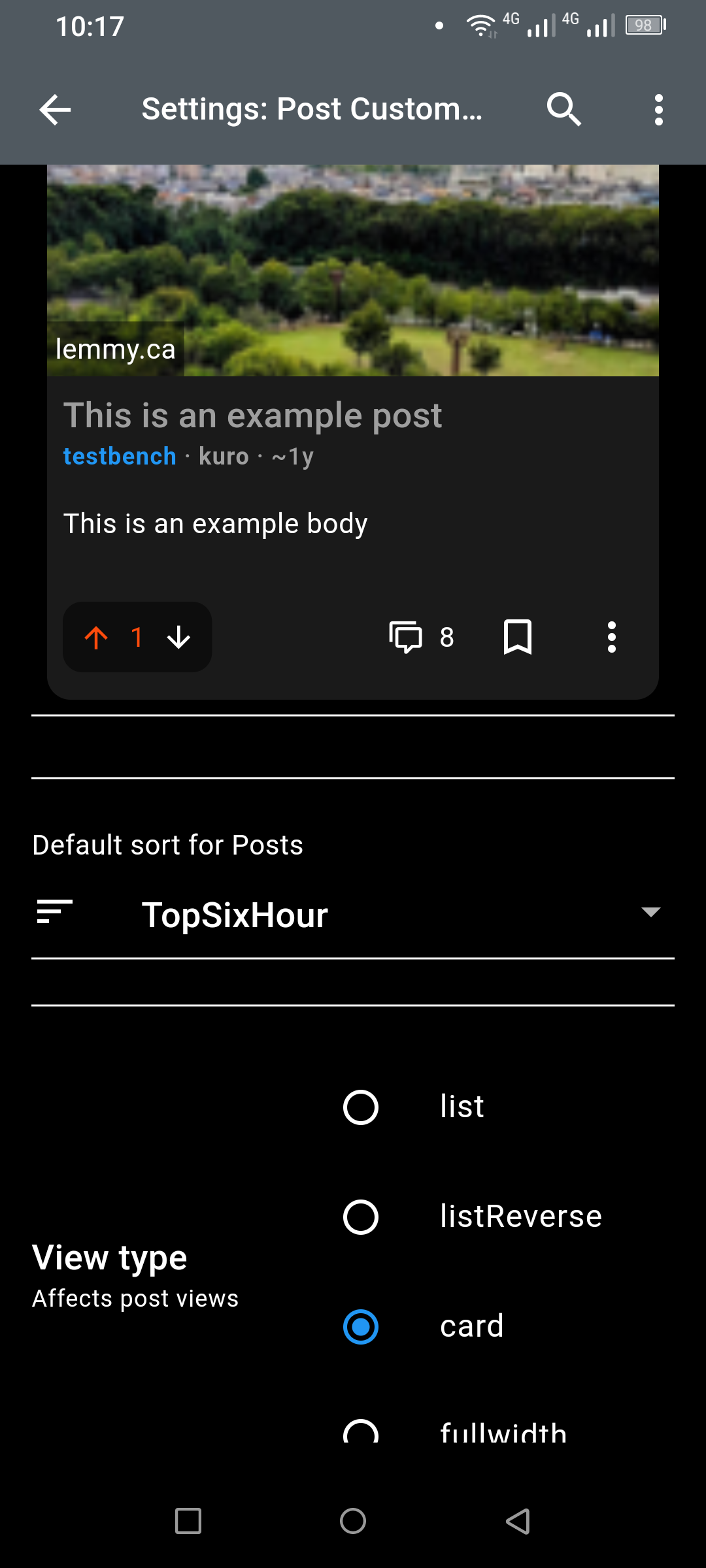
Hey I’ve been using Connect for a while with the Amoled theme. Nothing makes me enjoy the app quite like a pure black background.
With the new release, the background of posts in the feed and comments in the post is not amoled black but dark theme black. The sidebar menu is also affected. This was incredibly jarring and I don’t know how I can go on like this.
I appreciate the hard work and hope this is fixed soon, thanks
It has been fixed
Thanks for the report and I’m taking a look! I updated some core libraries last release so I suspect it’s related.
It appears to be the background for cropped pictures. If a card view picture doesn’t fill the horizontal screen, this grey colour is the border.
It appears that the thumbnails in list view have this grey border too, so it spills over the text.
This colour is not in the settings.
Are you still seeing this on beta v182?
No, it’s been fixed in the beta. Thanks.
Seconding this, experiencing the same thing.
Same issue and it’s very irritating.
Glad it’s not just me. It actually seems like all the default themes are behaving strangely after the last update.
Samsung S22+ if that is any help
To clarify: this happens only with List and ListReverse options. Selecting Card sets the right color.

This should be black

Card background is dark as it’s supposed to be
Same here. Everything is grey instead of black. Nothing in settings helps. Hope this gets fixed.
The menu is still grey on my devices, was it grey before? Everything else seems to be fixed.
Yes the menu was gray before. Would be open to amoled there too


