- cross-posted to:
- [email protected]
- [email protected]
- [email protected]
- cross-posted to:
- [email protected]
- [email protected]
- [email protected]
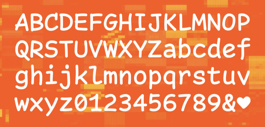
I don’t think I’d switch away from Fira Coda, but I think this would make a great prank.
I’ve unironically been using this font ever since I found it a year or two ago. I find it makes it so much easier to read everything. I’ve even suggested it to others. It’s actually a decent font.
I actually used it for a while and still have it as a terminal font on a computer. It’s not as best as you’d think. The characters have distinctiveness and it’s a very funky font. It was a pretty great change for a while actually.
Nope wouldn’t use it. The 1 vs lower case L are way too similar
The pairs version linked (which Is my daily driver), I don’t think it’s bad at all

I recently installed the linked font as my font in XCode and so far I’m loving it:
Thanks, I hate it! :-P
The font in the pictures seems fine but the font in the text is horrible. What is with those "y"s
The post links a similar free version (by someone else) that doesn’t have those Ys and Vs:


