
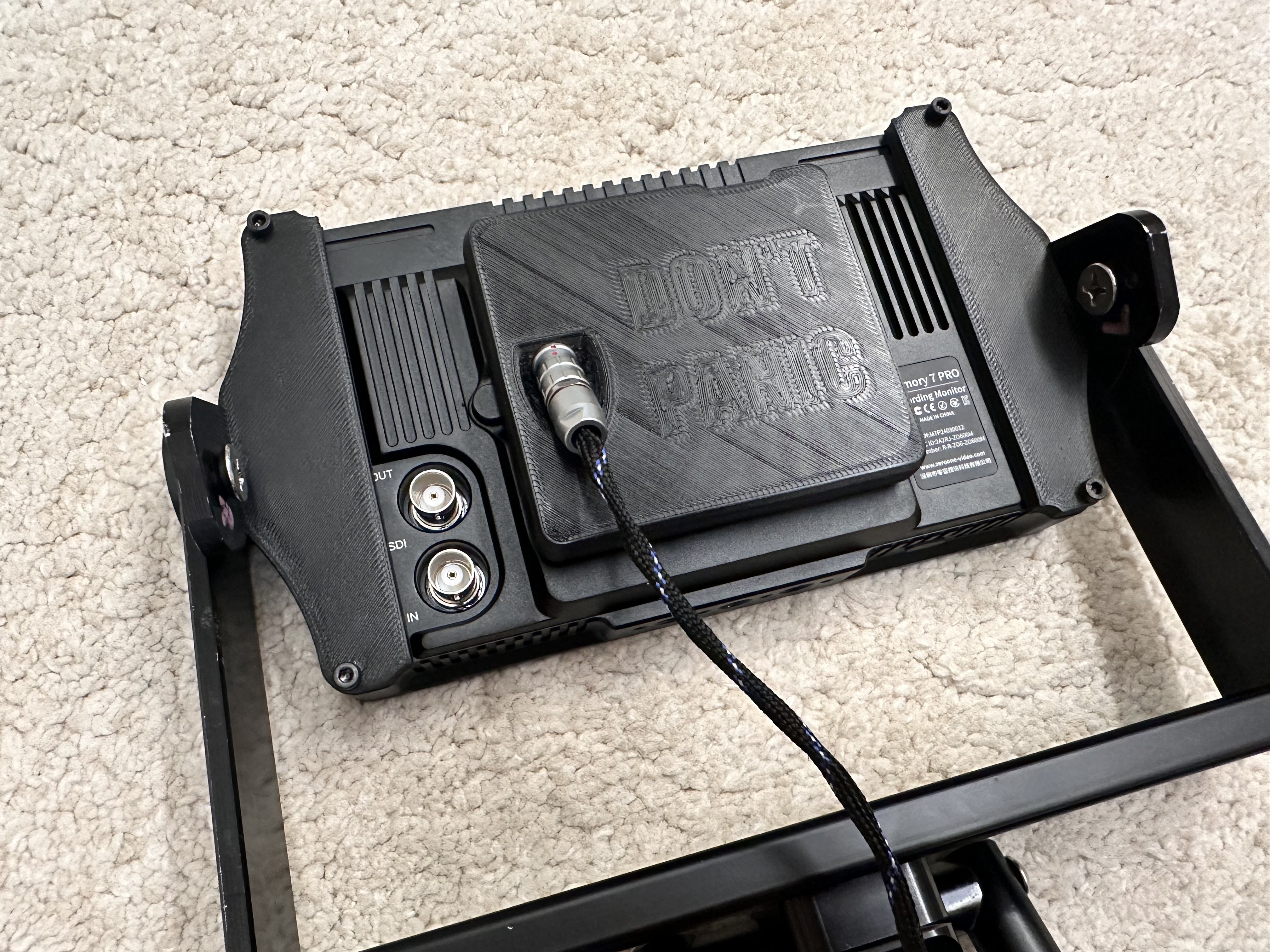
So I set this text to change the bottom layer to concentric only for the text and I got this. I had this large flat area in my print and decided to spice it up a bit for fun without doing multicolor which would be 1, too annoying to do manually and 2, too visible for this part that needs to be all black. So here I have a nice DON’T PANIC on the back of it.
Here’s a picture of the part assembled.

I actually used this earlier myself. I also like to use the negative modifier which will “cut” the text from the part
I do the negative when text is on the side of the part but at the bottom this seems to be better , especially for thick bold letters.
Fun idea and it can make a nice touch of detail to an otherwise dull area…but holy crap that’s a bad first layer.
It isn’t that bad. Just needs a bit of z-offset adjustment. Your comment isn’t helpful as it’s just an insult, not constructive criticism. Tell OP what they need to change to make their first layer not bad, don’t just tell them it sucks.
PA is also way too low (if it is even set at all). It could reduce the „thickening“ of the lines at each end dramatically.
Z offset like you mentioned is probably wrong, extrusion multiplier is probably wrong, extruder might be incorrectly calibrated, PA is definitely wrong. It really looks like it hasn’t received any tuning at all and this was just done with OTB defaults.
It really is t bad in the naked eye. I just slammed a reflection right on it. Or maybe was 0.01mm too high but I’ve seen way worse.
People accept different qualities I guess, if you’re satisfied and it works then there’s no reason to change things. I would say there’s significantly more things that need tuning than just z offset.
Please indulge me.
With a result like yours I’d honestly just start from the top of Ellis guide and follow through to the end, that should help you fix this and get a significantly better print quality. There’s likely a lot of things that are less than ideal, fixing only one or two won’t be enough.
Just jumping in here, the first layer does look kinda shitty, at least theres a lot of room for improvement.
Here’s a little guide to improve on a multitude of things by teaching tech.
Cool cura feature thou :)
Thanks. It’s an Orca feature. Not Cura.
Oups misread that

