
- cross-posted to:
- [email protected]
- googlepixel
- cross-posted to:
- [email protected]
- googlepixel
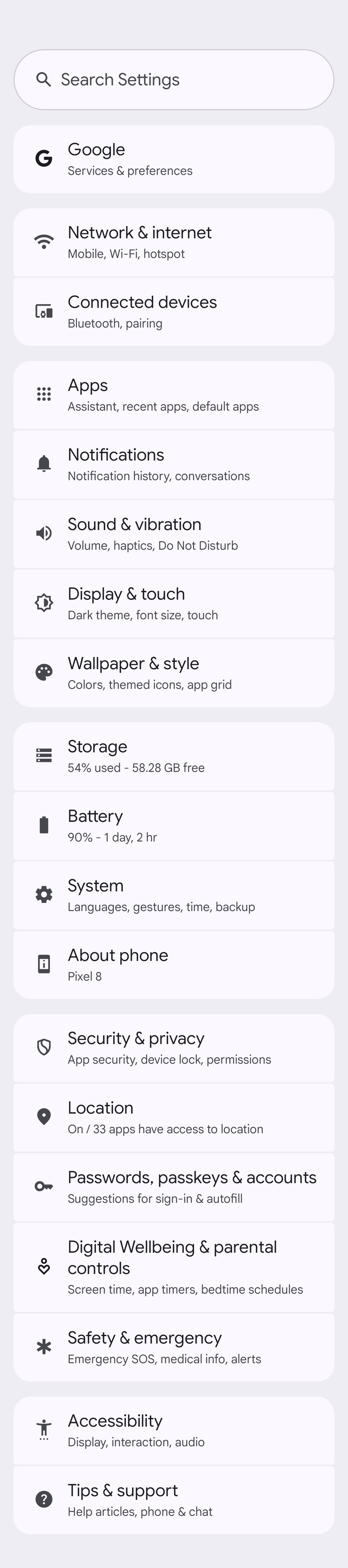
Android 15 QPR1 Beta 2 redesigns the Settings app with some Material You tweaks and better organization.
You must log in or register to comment.
I actually like this redesign. Anyone else?
I really like it, the settings app was lacking before
deleted by creator
I only ever use the search bar so IDC how its laid out
I like the layout but the design is worse, you have to reach even further up to access search. the colors also look slightly worse imo.
Yeah, that change is odd. Didn’t they just start to move things down so they are easier to click?
Google UI devs will do anything but follow their own material guidelines
It looks like a pretty minor change, but I appreciate it nonetheless.
I like it. Not sure the search entry in the list needs to always be on screen but it’s fine.
I like the new layout. Settings categories are better grouped together.
Of course though, Google had to put it’s settings at the very top even though it’s probably my least used settings menu. Other than that, the layout and order make sense to me.
Image for reference:
https://lemmy.world/pictrs/image/5637a9d5-3349-42d2-b206-9bb44bf5c7df.png
Just a tip, you can make those iamge links display inline by doing this:


