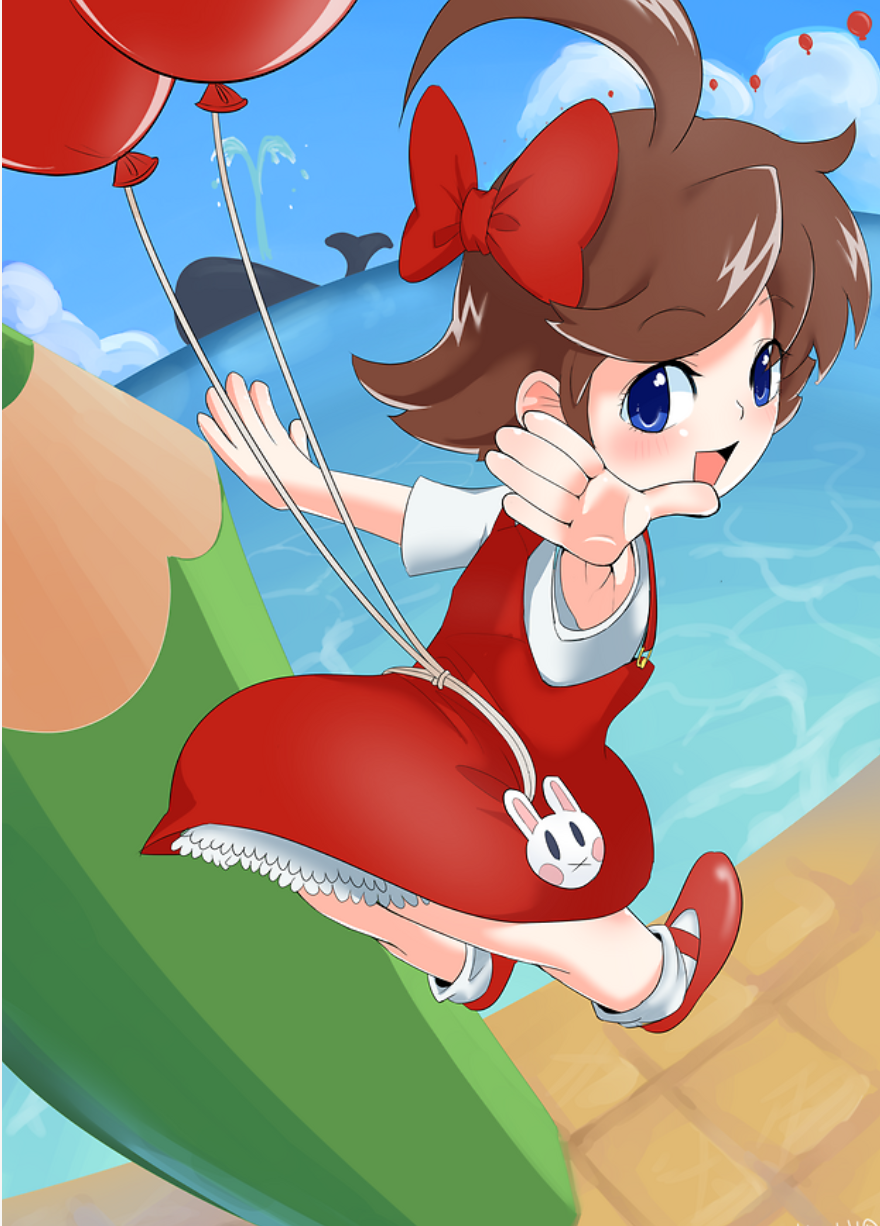
Hello from PieFed! [email protected] is never tied down to one platform, so I’m trying to post from my PieFed account today. Let me know if anything broke. I actually wrote alt text for this image, but I don’t know if it’s viewable.
The Balloon Fight spin-off Balloon Kid was a launch title on the Game Boy about 34 years ago this week in North America. This Japanese game didn’t get released in Japan until its ports years later, first to the NES as Hello Kitty World, then to the Game Boy Color as Balloon Fight GB. Alice can freely blow up balloons and fly with them in an otherwise standard 2D platform game where everything is trying to kill you.
The alt text made it to the default Lemmy interface on reddthat (it shows up as a tooltip if I mouse over the thumbnail), but doesn’t make it through to the “old” (mlmym) interface. (That might be a limitation of mlmym though.)
Her poor spine
Good composition, poor perspective and anatomy, to be fair though, this is a challenging perspective to draw, but I feel like using the mirroring trick would have helped here
I can barely draw a stick figure. Whats the mirroring trick?
Sometimes when you’re drawing something and focusing too much on getting the proportions just right it helps to have a different perspective. Often you don’t have someone around so what you can do is hold a mirror up to your drawing, (or mirror horizontal if it’s digital) and if it looks right while it’s mirrored your anatomy is all right. It really helps to show things that are off , like if you mirror this, you can see the face looks fine in both iterations, but the spine looks off when mirrored, this means it looked okay to the artist when in that position but the anatomy or proportions were off

Aha, that makes a lot of sense!


