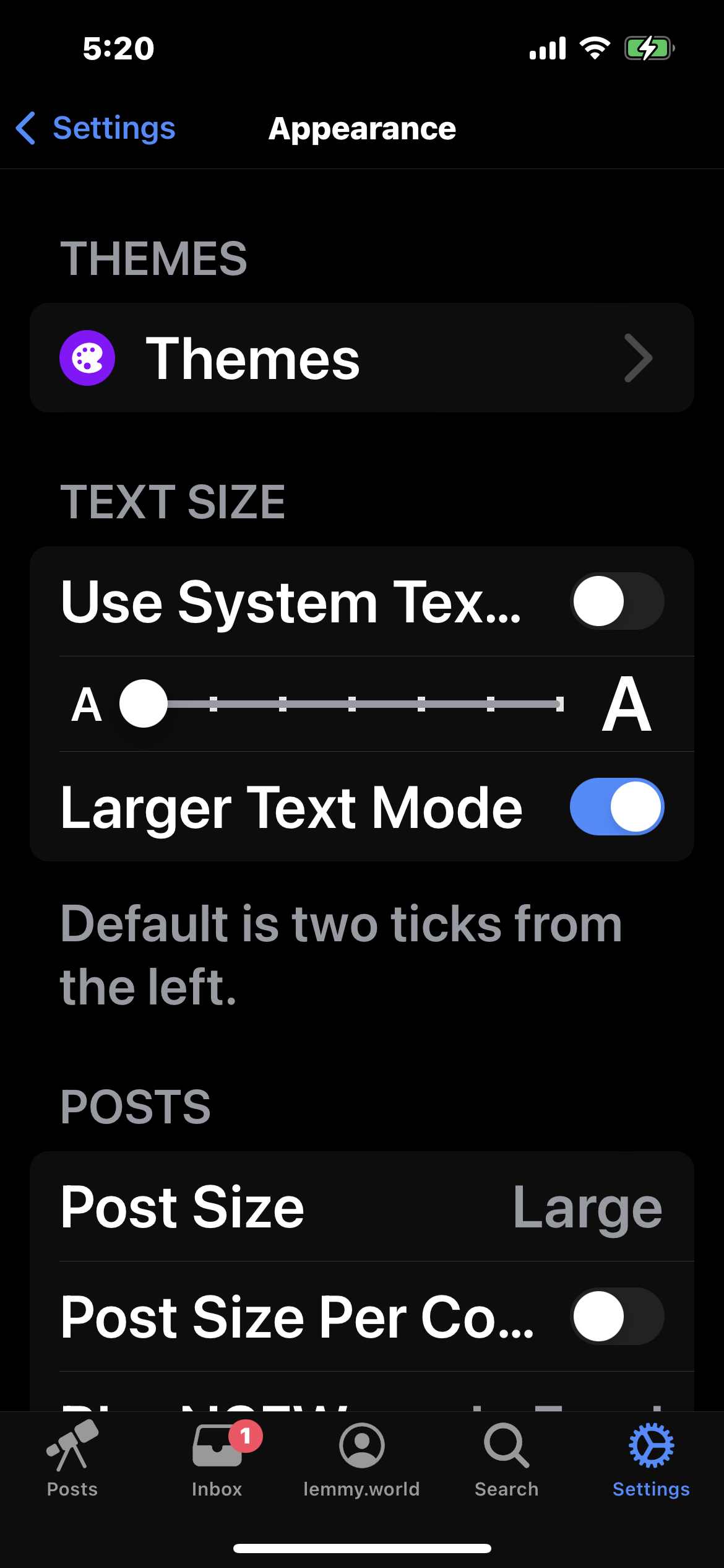
When in Large Text Mode, information is truncated with ellipses “…” Here’s a proposal for a better solution, which might help in regular text mode also.
Using Large Text Mode
In the feed we see posts appear like this:
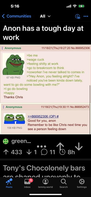
The community appears as “green…”
This could show the full community name and post username, allowing line wrap, followed by a newline and the counts on the next line.
So instead of
O green...
^ 433 v 1 O 100% O 8h
This could instead show
O greentext@sh.itjust.works
by user@instance
^ 433 v 1 O 100% O 8h
Yes allowing line wrap might break the text at non-whitespace characters, but I think that would still be ok. E.g.
O greentext@sh.itju
st.works by user@instance
^ 433 v 1 O 100% O 8h
Similarly when entering post and comment view
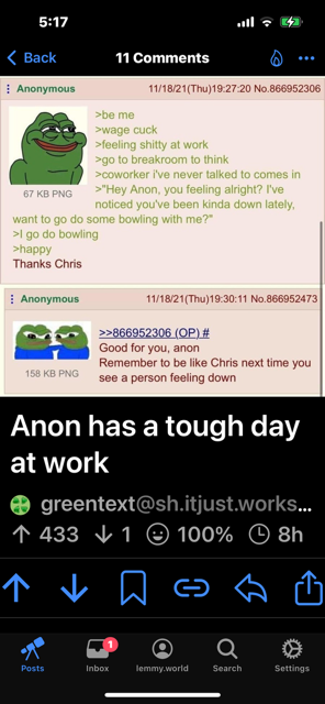
This could instead show
O greentext@sh.itjust.works
by user@instance
^ 433 v 1 O 100% O 8h
Then when viewing the comments

Rather than:
psycho_... ^ 14 v 0 ... 5h
You could again allow line wrap and add a newline between the user name and the vote counts.
This could instead read:
psycho_whatever@instance
                       ^ 14 v 0 ... 5h
This should still be okay for wrapping long user names that don’t wrap on whitespace characters. E.g.
some_long_user_name@so
me_long_instance_name
                       ^ 14 v 0 ... 5h
Also user profiles do not render well in Large Text mode.

deleted by creator
Yeah, good suggestions. This is something I want to get to soon