
You must log in or register to comment.
IMO, infographics belong in one of the “Cool Guides” communities (e.g. [email protected]). “Data is Beautiful” communities are more about individual graphs or charts, and also specifically about ones that present their subject in a particularly appropriate/clever way (as opposed to the data itself being interesting).
deleted by creator
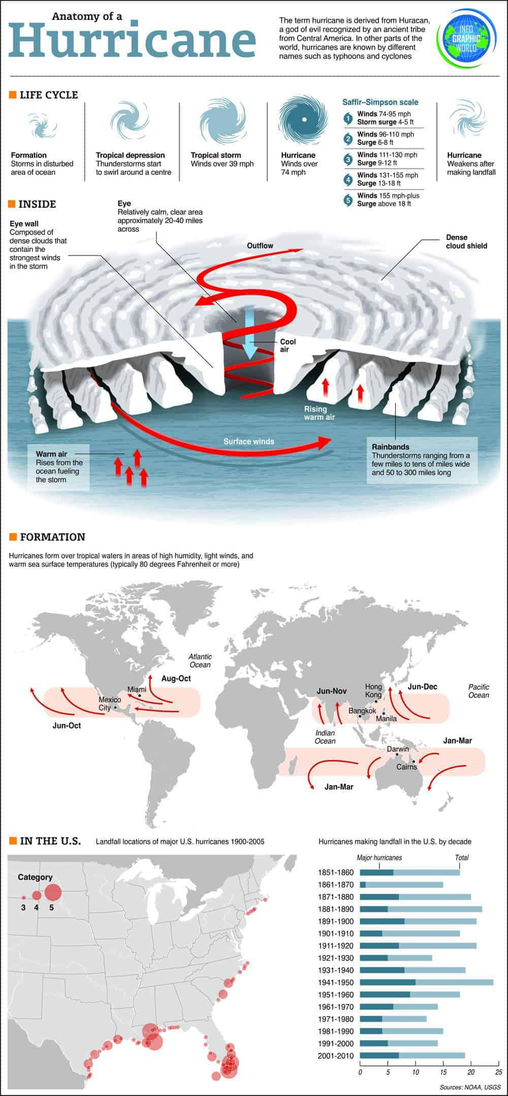
Since it shows the global distribution, an interesting curiosity: some years ago there was the first and only recorded hurricane in the South Atlantic, named Catarina after it hit my state of Santa Catarina in Brazil.
Since “hurricanes don’t happen in the South Atlantic”, Brazilian meteorologists were sort of ignoring the threat until the USians started calling to warn.
I was wondering about that, there’s a second band between Africa and Australia but nothing in the south Atlantic. What’s up with that?
I was under the impression that the number of hurricanes that made landfall had been increasing in recent decades, but the bottom chart suggests it’s about constant. Maybe it’s just the total number of storms then?
I came across this, which shows the actual trend line for hurricanes and tropical storms, including those that did not make landfall - https://www.gfdl.noaa.gov/historical-atlantic-hurricane-and-tropical-storm-records/
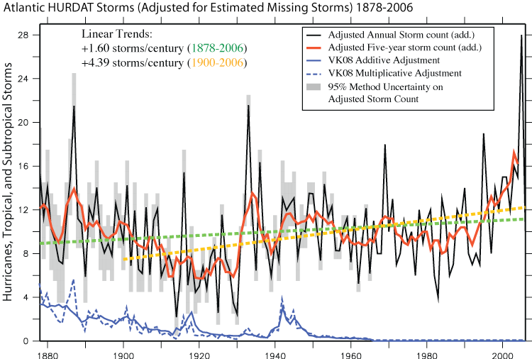
I was under the same impression, but it might just be that storms are getting more intense, and therefore we remember more of them in recent times.