
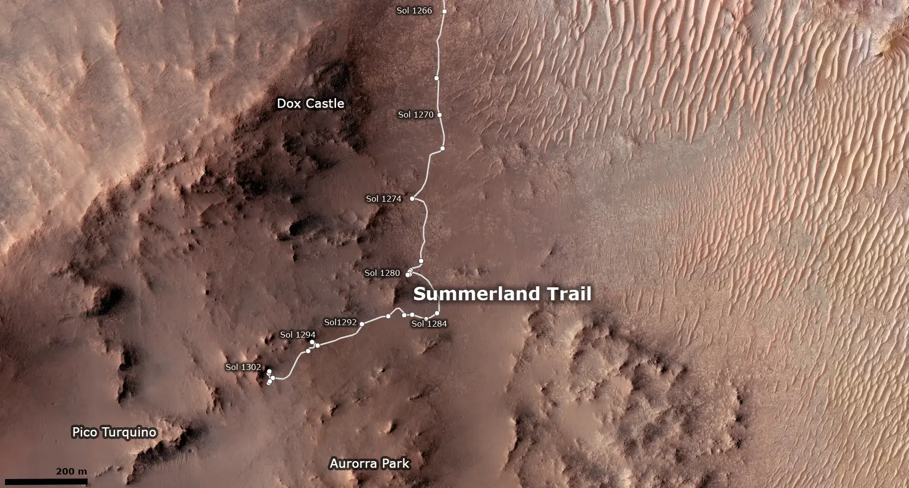
Improved mapping a bit, although I’m still just captioning the official map.
You must log in or register to comment.
Nicely done, I preferred the older JPL mission traverse maps as used on the early years of the MSL mission, as each waypoint and some of the larger features were labeled. I can only assume that the new style interactive maps can not cope with that level of detail.
Even the MSL map has more details, so I’d say that they very much can. The issue is that the interactive mapps are probably created by the PR team (as is the entire website) not the mission team itself, and that PR team doesn’t know most of the Place names and doesn’t thing that the average joe, who they make the sites for, cares enough to add them.
Thanks for posting these. Do you prefer this JPL version of the overhead view to the contour-lined ESA one?
I prefer the jpl one, as the hirise color is more useful than the low res low contrast hrsc one, and the contour lines aren’t that useful zoomed in. However, making a more zoomed out context map based on the esa one could be interesting.