YouTube Music has updated its mobile app’s Now Playing screen, moving the buttons around in the process. Here’s what the new UI looks like.
Looks more like they want the ‘interaction’ button closer to your thumb so you press them more often. It’s the same shit they’re doing with the regular YouTube app, it’s more infuriating than helpful as you will accidentally press these things more often than not.
“BuT eNgAgEmEnt WeNt Up!”
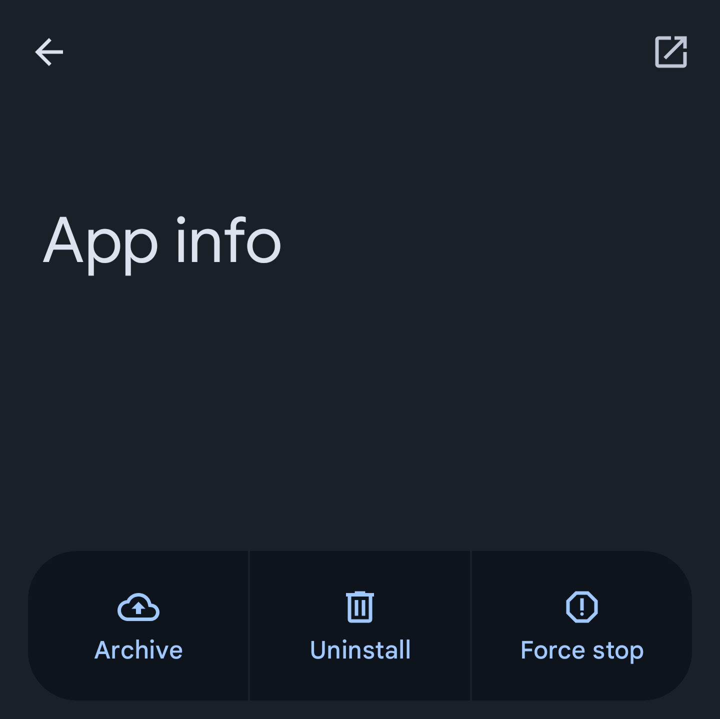
In Android 15, I noticed a different UI change that fucked up my muscle memory. The app info page replaced the “Open” button with “Archive”. I learned this last night when I had to force-close a misbehaving app and reopen it. (It’s a routine thing for a shitty app my work makes me use.) Instead of reopening the app, I archived it! Then I had to wait to restore it before I could use it.
The open button is now in the top right corner.


