Also works for searches ‘Times new roman’ and ‘Courier new font’, but not for ‘Lucida console font’ or ‘Dejavu sans font’.
deleted by creator
I was just thinking it didn’t feel as offensive as I remembered. Seems that the fake comic sans is more normal.
I think it’s Comic Neue, an enshittified version of Comic Sams
just because you personally like something less, doesn’t automatically mean it’s “enshittified”.
Comic Sans is freeware. Also, they can use CSS to force Comic Sans if installed.
deleted by creator
I heard they had to make it freeware to put into web standards. So they didn’t and still made it annoyingly ubiquitous? Bastards.
That’s definitely not Comic Sans. It’s similar – you can compare the screenshots in the image – but I’m guessing it’s a licensing or cross-platform thing and they’re using a Google webfont?
There are several easter eggs that still work. A few of my favorites:
- Search roll a die and it’ll bring up a special box with a virtual die in it.
- Search askew to tilt the page.
- Search either do a barrel roll or z or r twice to make the page spin.
- Search recursion and it suggests you search “recursion” instead.
- Search anagram and it suggests “nag a ram”.
- Go to the Google frontpage, type zerg rush there, and hit “I’m Feeling Lucky” for a swarm to destroy the search results.
It’s the phrase “that still work” in there that’s depressing.
A lot of these are holdovers from Google’s cool new kid phase back before hope for the future died.
Yep, right about the time they dropped “Don’t be Evil” from their code of conduct.
In case you needed any more proof that Google has become the evil thing it originally promised not to be…
It’s the fact they did not include all of CJK characters in their fancy new Roboto font, so we need to have several .ttf files for all languages.
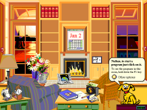
Another but if Comic Sans trivia, it was originally designed for Microsoft Bob OS. However it was not finished in time to be included.
For those not aware, this is what Bob looked like.

Is Comic Sans ADHD friendly?
If you have ADHD you know that nothing is friendly. Or everything can be. Or something that triggers feel good becomes interesting and good. Maybe you know why you asked the question, maybe it doesn’t matter. Maybe I forgot why i started answering this in the first place.
Point is maybe?
This hurt me because my eyeballs glossed over it like wtf and my brain was like, oh, yeah, I’m in this picture and I don’t like it.
Comic Sans gets a bad rap but I used it for my system theme font on my first smartphone years ago. The same is said about Papyrus which was my favorite OG default font for mspaint.
all comic sans ever wanted was for us to have some fucking fun. we ridiculed it, even as it turned out it had major benefits for neurodivergent readers. we are the villains, not comic sans
I remember the first time I discovered Comic Sans. Probably like many other people - I was playing around with fonts on a school computer, and was like whoa… what is this font, I love it! It’s like a comic book!!!
Like seriously what is not to love.
Then my generational cohort of cynical millennials took to the internet and bonded over mutual hatred, and dragged this poor typeface which only ever wanted to bring a little levity to otherwise cold, machine produced text.
and it was never really comic sans we hated, was it? it was our managers using it to pretend they were fun. we all collectively bonded over blaming the wrong thing for our frustration
When I was in school for graphic design, anyone who used a default font would automatically fail a project.
Also, current SNL sucks compared to this.
Nice try Gœgle, nice try.
Is comic sans ADHD friendly?
There are better fonts now for people with dyslexia. I think ADHD and dyslexia are different things though, there’s no specific ADHD font.
Yeah lol it was just one of the suggested searches I found funny.
I think font (as long as it’s readable) doesn’t matter much but lot of people have found help in a technique of “hyperbolding” specific parts of the word to make it easier to focus on the reading or something.
For me personally it was distraction, so I guess it’s individual thing
I love using it when some typeface nerd spouts off about why it’s bad.


