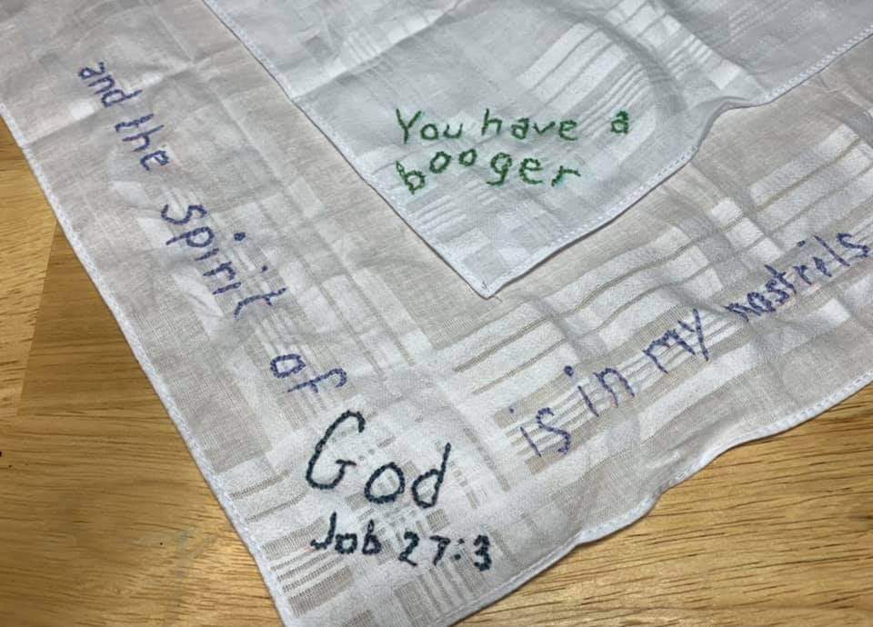
This is going pretty well except I think I picked two shades of orange that are too similar. This pattern doesn’t actually tell you which colors to use it just says it’s designed to use whatever you already have lol
You must log in or register to comment.
Looking good!
Thanks!
I think the problem with the oranges is that they don’t have much value contrast (that is, neither is much darker than the other). It still works well enough, though.
It’s starting to look better the more I get done, I think I just got worked up before there was enough there to see the difference lol


