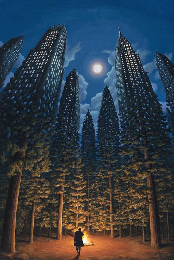
It’s mind-boggling imagining someone sitting there and coming up with something like this. Seems like the sort of art you’d need an AI to generate.
not only would it take mind-boggling imagination for someone to come up with this but also inhuman precision to actually be able to put it on a canvas.
Or LSD
i feel like i can zoom in forever
deleted by creator
that’s fantastic, thank you so much!
i feel like i can zoom in forever
You may enjoy fractal art.
I do
Escher was first inspired by the tessellated patterns of the Alhambra in Spain during his travels in the 1930s, and the geometric, some would say mathematical, style was prominent through the 1960s. The woodcut Smaller and Smaller was done in 1956. You could almost say he influenced the art of the 60s, more than the other way around.
Alright this is the most neurotic thing I’ve ever written but the lizard primary->accent color map is
'((light . dark)
  (medium . dark)
  (dark . medium))
and at first I thought it would be more symmetrical if either the light lizards had medium accents or the medium lizards had light accents, but then I noticed that the outline is always dark, which lets the outline act as both the background and either the primary or accent color for every possible lizard configuration, adding depth. We don’t have time to bring color theory into this but I would be remiss if I didn’t mention that this piece is inexplicably sepia toned, which raises further questions such as “what is wrong with me” and “how am I going to put this piece in my dining room without having to defend the 1960’s?”
What was the inspiration behind the art style? Looks very 1960s to me
Ah, my namesake artist!
lizard
deleted by creator


