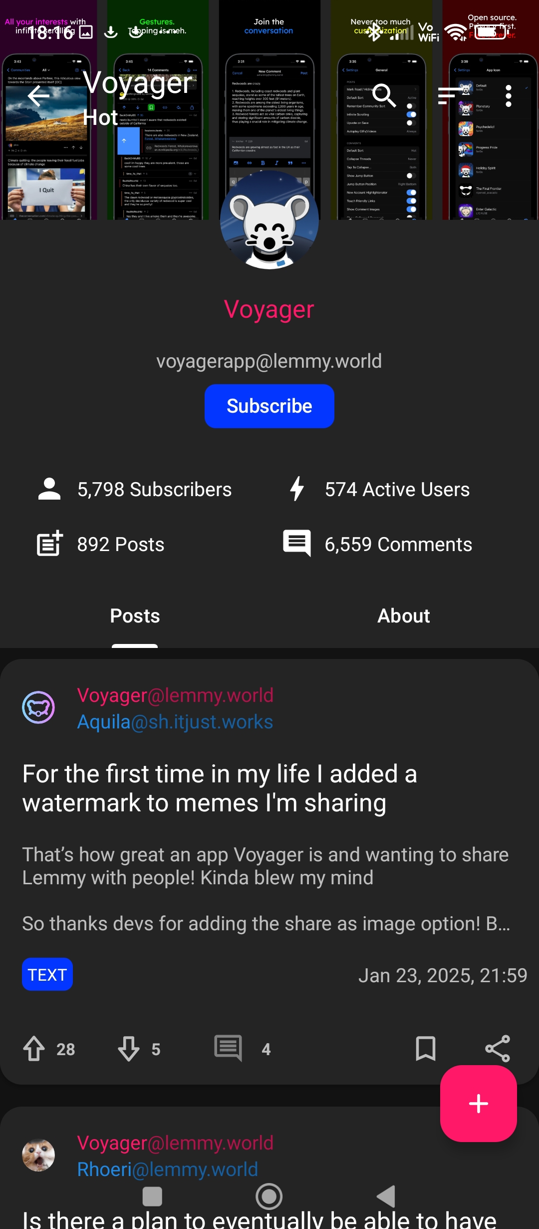
Eternity:

There is no way to force community metadata at the top, no. Voyager avoids pushing content below the fold, it’s Voyagers design philosophy. You can access that info by opening the sidebar if you like.
This is the best part of Lemmy though, there are lots of apps to choose from to fit your taste.
If just find if jarring because you’re used to another apps UX, I recommend giving it time to get used to.
there’s gotta be a better way to view the sidebar than through a 3 dot menu though
You can long press the community handle, maybe a bit better
Tried adjusting Settings>Appearance>Post Size: Compact already?
Edit:
Think I may be misunderstanding after reviewing the screenshot and playing with settings. I’m thinking you’re after more of an in-between?In which case yeah, as others said it doesn’t appear Voyager settings allow for that.
Correct, I actually want more empty space, fonts make everything too big and there isn’t a way to change options so that I can declutter it. It’s hard to look frankly
You might give the Thunder app a look. It’s cross-platform as well and has some settings that allow for more of an in-between look of Eternity and Voyager. It still may not allow for as much empty space as you’d like though.
I think they might just have very different design philosophies, and there isn’t a way to make it look like that.
As someone who has been using the Compact post size for many years (starting with Apollo), my first instinct was to change the setting to Large.
Nope. Not what you’re looking for.


