

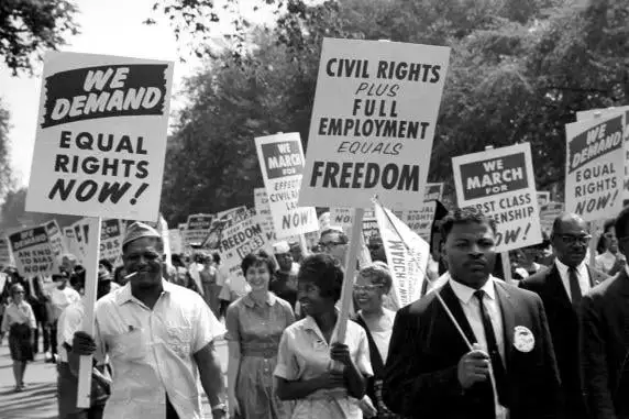
We currently have the following lead images for this community:
Icon:

Banner:
With enough heavy things going on in the world today, let’s have a focus on something light. I’m opening up discussion for a week or so on if you think these images are representative and should stay or if you think we should change one or both. If you support change, please submit alternative images for either image type and maybe we can throw up a poll at the end to vote.
Is the banner image representative of the anti-work ethos? It seems to be celebrating work (if not equality, which is something else entirely).
I get that there’s a tension here, as expressed in the blurb - you need to work, at least a bit, in order to pay for idleness. But IMO this is contingent, it should not be front and center. What’s important is the value of idleness in a society of abundance where material needs have been met already. That’s my view.
Well said, strong points to consider.
IMHO, part of Antiwork is supporting labor at its ideal, along the lines of “if you do what you love, you don’t work a day in your life”. If I could have my basic needs met otherwise in a society that (to your point) already has redundant resources to care for every member of society in perpetual comfort/security, then that labor can be a personal choice that is personally fulfilling. That also assumes that a person is FULLY compensated for the value of their labor.
So I think there’s nuance to the discussion and somewhat ironically Antiwork does have a strong foundation in supporting equal access to fair labor - most likely cooperative labor though. But inherent to Antiwork is that one always has the option to not participate in labor, if they choose.
I kinda thought about it like that too. It is pretty dumb to be anti-work in a sense of wanting to just lie in bed and do nothing the whole life. So I always thought it was more like anti-awful-workplace-practices
