- cross-posted to:
- [email protected]
- cross-posted to:
- [email protected]
You must log in or register to comment.
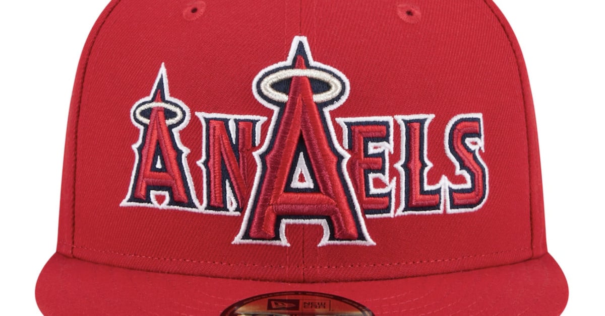
The only ones that look anywhere close to passable are the Cubs and Brewers. And those still look bad, just not “what the fuck were they thinking?” bad.
What a TERRIBLE design. They literally look like mistakes.
Maybe that’s the idea. Like how misprinted baseball cards are worth a ton later on. I can’t imagine anyone would wear these for real
Lmao that is a terrible design, how did no one involved in the design or production of these not put a stop to it 🤣
There HAVE to have been some people in the design pipeline who were just thinking “Oh man they’re actually letting us get away with this!?” the whole time
The design was intended to be stupid, so people talk about it. It’s essentially free advertising if it goes vital. If it fails, whatever. Fans aren’t gonna stop being fans over this.
Anaels and Tetas, hehe