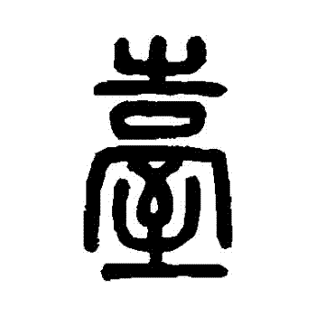
It’s silly, but I like the proper 臺灣 better than the lazy version 台灣. It looks more sophisticated and is more official. I vote for the title of the community to have the lazy 台 replaced with the beautiful 臺. Anyone else in? Much love.
Edit: spelling
My original idea was to split the difference with 臺 in the icon and 台 in the name. Judging by the upvotes this is a popular idea.
I think this is a good approach. The seal script is beautiful and clear in the logo, and 台 in the name seems most common. I like the traditional 臺 when it is large enough to see the strokes, but I’m not as partial to it when it is displayed small and cramped on a screen.
Give you some perspective, the Taiwanese almost always writes 台 because it’s easier to write, even the news writes like that. However, 臺 is the official letter to write. If you refer to any of the official documents from the government. It’s always 臺灣.
In reality, most Taiwanese does not care.


