It would be nice to be able to reply to replies in your messages or notification damn directly from the tab. Instead of having to open the post and find where the reply was. Especially for situations where it is a post with a lot of comments searching for the specific replies little tedious
Go ahead and reply to this comment so I have something to reply to myself, then I’ll document the steps you need to reply directly to an inbox reply.
Relying so you can document the steps
I can reply… with jerboa.
Step one Tap reply icon
Step two Type reply
Step three Tap the paper plane
Step four Profit.
This isn’t what I’m referring to. I’m referring to the notification tab at the bottom with the mail icon. In that there are a few tabs, the first being replies. I want to reply on the reply page
my bad!
Okay good, I just wanted to double check that what was in my head was correct.
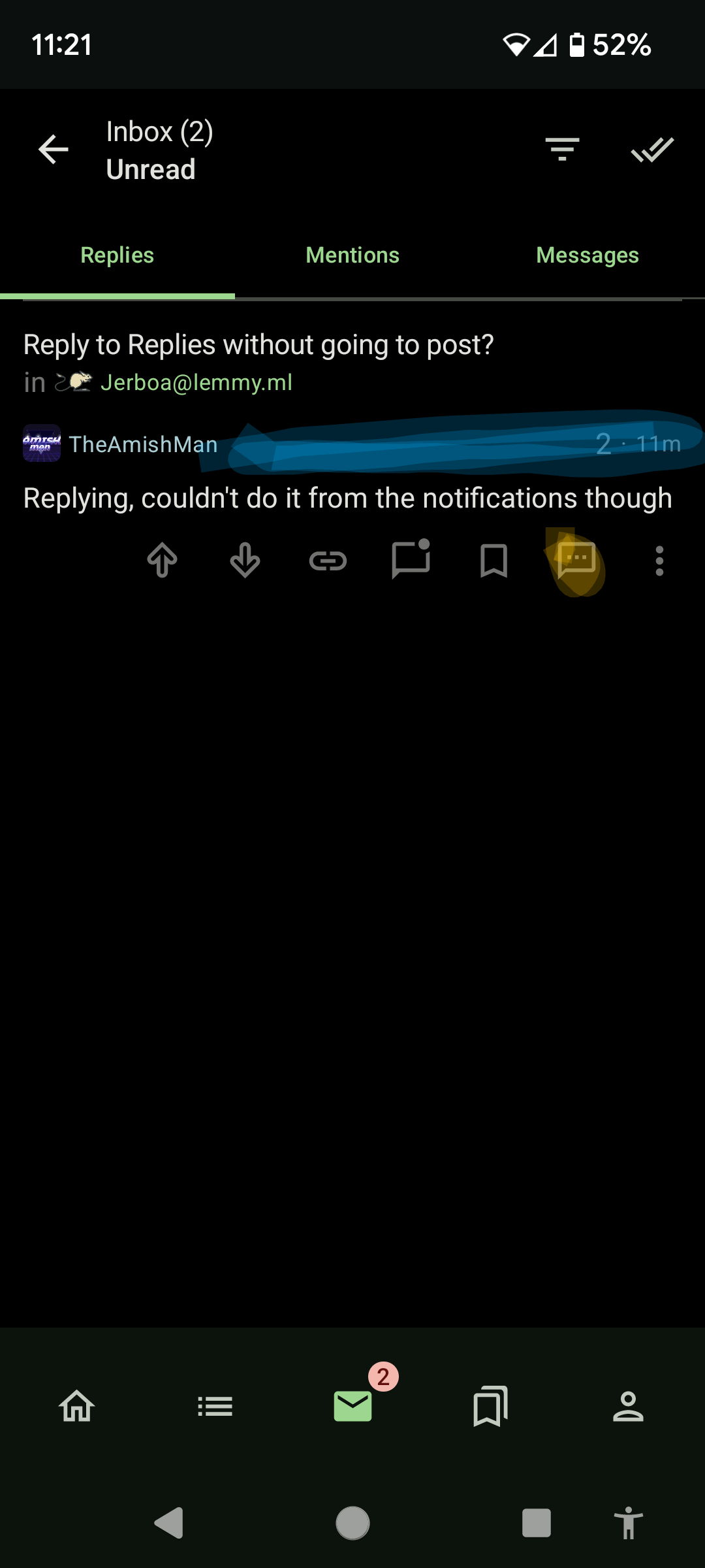
Right now if you want to reply from your inbox you long press on the empty space to the right of the person’s username in order to get the action bar underneath to show up.
Yes, I know, it’s a dumb UI bug/implementation, especially since it’s inconsistent with the general thread behavior of the action bar, and the check box in the settings doesn’t seem to impact its behavior.
Anyway, once you’ve got the action bar you can reply directly in your inbox with the little conversation bubble in the lower right. You can also go directly to the reply in the post using the link icon to the left-ish. You can mark the message as read using the other conversation looking icon somewhere in between the two I just referenced.
I’ll come back in here and add screenshots in a second.

Replying, couldn’t do it from the notifications though
Since two people replied, and I didn’t notice you were OP, the other person got the full explanation.
Awesome thank you. I tried doing the long press, but want doing specifically the empty space. Using the function now, seems to work, thanks!
You can, but it’s difficult to find since the last update. To the right of the username at the top of the post there’s an invisible field. If you long press it then the menu at the bottom will show… Somewhere right of username, left of votes.
The only reason I know is that I tried the app before the update, so I knew it was possible and someone posted about it previously.
I really hope they fix this soon. Not only is the space saved not worth the hassle but it’s also completely impossible to find, and on longer comments it makes no sense to long press the top to open a menu at the bottom, and long pressing is an insane gesture to use for an invisible field. The same feature is on all regular comments, except that the menu is visible by default.
Ok this is awesome, thanks. I’ve been wishing for this all day today!
Yea its a bit weird that you have to select that one specific area. Even if I could do it from the entire message, which is what I tried initially, that would be fine. Nevertheless, thanks for the help!


