
Okay hear me out for just a second…
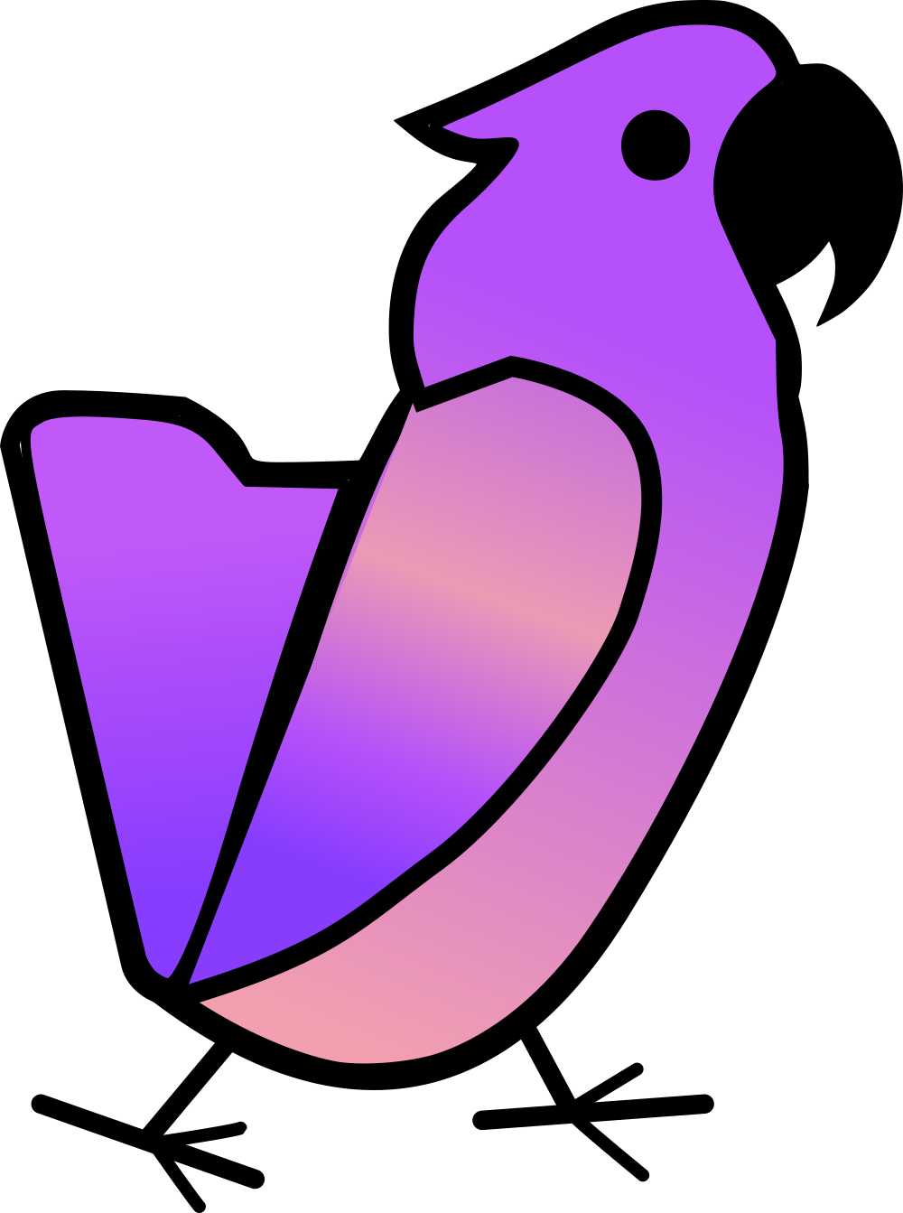
This is the right approach. Create the mascot with some uniquely identifying features (looks, shape, color scheme etc) first and then make a logo / icon out of it. The OP is a generic looking white parrot head on a purple background. Better to make the mascot purple to fit the purple folder logo.
I like it, I’m down for collaborating all together, it should be like that, that’s the spirit of the Fediverse
Thanks, it was just a remix of the two images, I thought might be kinda funny/quirky. I claim no ownership of this idea / design feel free to use it if you like (might make it my kbin app launcher icon thought!)
Have fun with it! for what it’s worth, I like the idea of a mascot but maybe in the more semi official way tux <-> Linux
Thanks for the fun idea really nice community here.
i love this
I hate to say this since I really like the logo (once you see it) … but I also see a balding man’s profile.
If you look from right to left. The beak is the hair, the eye placement is the same, the bird’s feather (left hand side) is the man’s nose. Underneath the nose is a double chin.
deleted by creator
Honestly, this makes it better.
It’s a 2-in-1, no mistakes only happy accidents.
I like it. Absolutely fitting for the early adopters of nerdy tech.
Came here to say this! It took me way too long to actually see the bird. It’s obvious once you see is but I definitely saw the fat balding man first
I opened this thread because I had the exact same thought, except my brain went to “dove (facing left) with a toupee” instead of “balding man”.
It’s funny how you see it in so many ways whereas I can’t lol maybe I’m too used to cacatuas
I take no pleasure in inflicting this upon the world. Just remember, you asked. Behold: the balding man.
The man’s name is Kenny.
What did you think the “k” in “kbin” stood for?
you’ve heard of beehaw, now get ready for kcaw
Inb4 someone spins up kcaw.social
if that doesn’t work out, make your own kbin instance called kbird, and use it as your logo!
Nice mascot drawing! Cockatoos are smart, noisy and annoying as fuck. I won’t draw conclusions about which traits we kbiners match haha.
Bird Up
Bird is the word!
I support kBird and wish it the best
For the love of god, people, even if you like an idea very much, and want to be supportive of someone’s efforts, it doesn’t mean you can’t be constructively critical!
The line work on this bird is atrocious. The idea is good, the general design idea is good.
It is a terribly executed bird head though.
The line weight is too low for the size, it’s full of weird angles with lines not flowing into each other. Intersections around the beak are not clean as they look doubled up in places. There’s no clear gesture in the shape language to either let the eye rest or direct it in meaningful way.
It’s a somewhat cute bird, but this has to be cleaned up, a lot, to function as a real mascot.
As it is now, it’s at the design idea stage.
Oh yeah I always said “idea” never “finished product” if someone wants to take a crack on it and improve it, they’re not just guest, they can come to any part of this house.
I’m just a dude who doesn’t have any background in art. So the whole terms of “line work” or “line weight” mean nothing to me.
What I see is just a nice little bird icon. And if that logo was used everywhere it would be instantly recognizable at a glance. So for me as a user of a platform it would do perfectly fine as is. Maybe it could be improved upon but I wouldn’t be able to tell you how.What I do not appreciate is how the comment you replied to presented their feedback on this. They might know what they’re talking about (or not, this is the internet. Anyone can make any claims.). If this is supposed to be constructive criticism, I can confidently say they’ve missed their mark due to their tone alone.
I never meant you in particular meant this to be a finished work, in fact I thought you posted this in hopes of getting some constructive feedback rather than the blind adulation everyone showed here.
As far as I can see, nobody even bothered with thinking about what they are looking at and participating in the process of making it better, except that one person bringing up the balding dude silhouette.
I think it’s on the right track as it is. Needs the improvements I mentioned, plus anything I can’t see obviously, one person can’t notice every detail ever.
As for help, I didn’t offer any as I don’t do vector art myself, so I wouldn’t be able to solve the issues I mentioned, perhaps ironically.
well more people could help in a way, for example, making a 3D version of it with super realism, out of my realm for now, as long as people are in for a cacatua or any bird
legit
The (k)bin bird should be a bin chicken though: https://www.youtube.com/watch?v=w4dYWhkSbTU
@FixedFun all hail the party parrot!
i like it!
I prefer the existing logo, but I appreciate what you’ve done here and wish you all the best in future endeavours.
The logo kinda looks like a file manager, so not the biggest fan. I like the bird though.
Both look awesome as a design piece
How do we tell him? ha ha, better leave it you to figure it out.


