
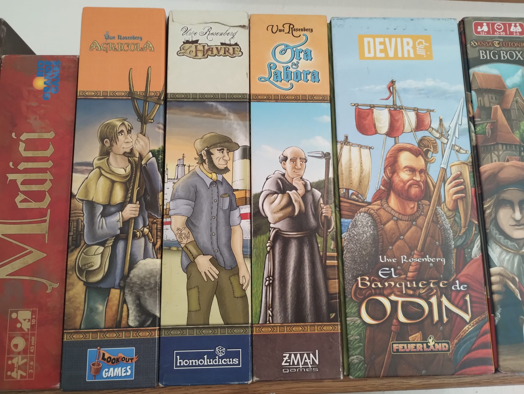
I have four Uwe Rosenberg games. Three of those follow a similar format: game title on top, then a line, then some dude, another line, publisher logo. But Feast For Odin had to go and be all creative and unique.
Take a cup of tea, it’s OK.
and all the dudes are facing in the same direction, what are they looking at? Or are they waiting in a queue?
The first 3 are designed by Clemens Franz, A Feast for Odin was designed by Dennis Lohhausen. Dunno if that applies to the box design though, but clearly a different visual style.
It’s just a way to differentiate from other games and make it seem more “exclusive” since it is also much more expensive.
They probably also had higher costs since it’s not the standard format.
I really don’t care much about it, but if you buy the expansions it will probably look better 😅


