
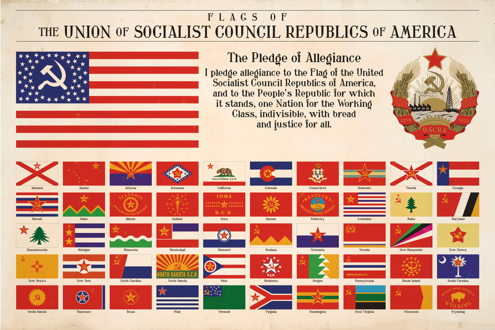
So, so many words on these flags. Somewhere out there, CGPgrey is actively sobbing. I adore Montana and Oregon, though.
Everyone gets a sickle and hammer except Colorado and Wyoming.
Wyoming doesn’t even get the star lmao
Awkwardly pasting red stars and sickles onto existing flags with the occasional factory motif, very much like real life socialist flags.
The Oregon flag design is pretty clever, but I kind of hate it at the same time.
So many hammer and sickles, communism really does make everything the same for everyone
Of course. Even Soviet Indiana’s flag sucks.
Huge missed opportunity with South Carolina to just turn the crescent into a sickle.
Go post this on Truth social as “Bernie Sanders’s secret plan” and watch the MAGA ants get all riled up
Tennessee: still a banger.
Thanks for wrecking Ohio’s flag, Regicollis
Removed by mod
Here you go: Link
Beep Boop I’m a bot. Maintained by Thomas Douwes
Did I get something wrong? if so please message @[email protected]Removed by mod
Maine and Massachusetts are basically the same flag
Well, many of the flags of the Soviet Republics were basically the same as well. And of course many of the US state flags (SOB). The similarity might simply be due to laziness, but it is quite realistic as well.

