

You must log in or register to comment.
Home Assistant joins the trend for hyper minimalism, not sure I’m a fan of it myself.
At leasts it’s still fairly recognisable.
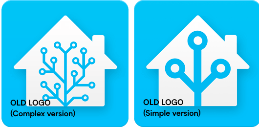
I don’t mind a little bit of simplification, as the previous logo had a lot of little granular details that arent going to be as legible at different scales, but I’m not sure I’m entirely in love with the execution here. I like that they kept the nodes offset as opposed to the previous version for smaller scale applications, but the point where the left node originates from is too close to the base of the house, putting too many corners in close proximity for them to read clearly enough as separate corners and for them to not just merge into a bit of an organic wiggle if you’re not looking close enough.
I don’t hate it though, and I think overall its a decent improvement in some respects. But I think the old one had more character, and was a bit better executed, even if it didn’t works as well at all scales
This must be the first minimalist take in the past decade that’s actually good, though. They’ve kept the color, and the shape is still pretty recognizable.
Simple and effective, looks pretty good
The old logo was a better portrayal of my tangled web of smart home stuff lol
…there was already a simple version used for favicons that didn’t look as bad, it’s the one on the right. Switching to just using it for everything would be fine, instead of this… thing with the awkward left branch joining the main one at the bottom.
I like the new one way more, the old one is too symmetric.
New one is way better, the old ones were alright but borderline programmer art level
Cool
I sorta hate it.
It’s not immediately recognisable as a house anymore which is bad for attracting new users. Also the “antenna” is less interesting and used to be immediately recognisable.


