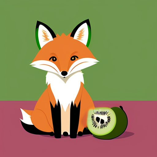
I’m not a designer myself, but I thought it would be cool to have a design contest where people could voluntarily propose new visual elements for lemmy.world like a new logo, new icons for “main” communities, default avatar for people without avatars etc…
Might be too early for CSS changes though as I understand that Lemmy’s web UI is still changing?
I had this shower-thought the other day for a Lemmy feature: user avatars should sit inside a donut shaped “instance avatar”. Like many (most?) people, I’m new here but I’m already seeing that instances are a larger macro-community so having that extra bit of identity makes sense to me.
I’m not a graphic designer but the idea of visually playing your own avatar off on your instance’s avatar sounds fun.
Just something I remembered while reading “visual identity” in the title.
user avatars should sit inside a donut shaped “instance avatar”.
Forgive me for I am about to make a terrible word, and a terrible joke(?), an “instatube”. Y’know, like an inner tube the avatar sits in, themed after the instance like you kinda describe.
If you’d like to suggest CSS changes, I’d recommend you make a pull request on github for lemmy-ui. I asked in the beginning of June when it first opened and the policy is that @ruud is not going to adjust the code.
There was a thread where we discussed various options back when we only had like 1000 users, but the current instance logo appeared shortly after so I can only assume the admins thought all our ideas sucked 😅
Naw. Its fine as is.
