Hey Everyone!
I’m submitting a small update (1.0.7) to the App Store today that changes the following:
- Added new theme: Sky
- Added an option to hide or show usernames on the feed.
- Bookmarks no longer hide read posts.
- Fixed format bar on comments covering text.
Apologies for the delay on getting an update out to you all, hopefully I’m fully recovered from being sick and ready to get some more stuff out to you all soon.
I’m still working on messaging which will hopefully be in 1.1 soon. After that, priority will be iPad with smaller patches for bug fixes in between.
Thank you so much for the support and welfare checks while I was gone. I really appreciate you all ❤️
Sooo looks like the Sky theme might break the app. Bean crashed when I selected the theme, and I can’t reopen. Posting this from my desktop.
I’m on iOS 17.0.
Same problem. iOS 17.0 as well
Same here, and I’m on 17.0.1.
Same here. Had to reinstall the app
Very strange! I’ve not been able to replicate this from by debug build but will try with the App Store build.
Does a reinstall fix the app for you?
I’ve been able to replicate it with the App Store build. Looking into why now.
Glad you were able to replicate it. Let us know what you find. If I don’t have delete the app and re-do all of my settings, that’d be preferred. But I’ll do it if it will help with your troubleshooting.
Update being submitted now! Sorry about the hassle.
No hassle. Thanks for all you do!
Good question. I just picked up an iPhone 15 Pro, and setting that up as we speak. I’ll test it out on there once setup is complete.
I do want to know what you think of the 15 Pro, what colour you got and what you’re gonna use the action button for!
So far:
- I miss the size of my 12 Mini. My hands are too small for this thing.
- The camera is awesome!
- Ignoring that I like smaller phones, the phone does feel luxurious in the hand. I like the titanium, and I’m debating not covering it up with a case.
- I got the natural titanium.
- I currently have the action button set to flashlight. But I might change it. I tend to use that more than any of the other options, especially when walking dogs at night.
Love the look of that natural titanium, I’m very envious!
I also am totally with you, even my standard 12 is too big for me and I have to use a popsocket to be able to hold it properly 😅
Yep, I had an OhSnap on my 12 Mini 😂
I’m using the Torras OStand case on my 15 Pro, which has a ring that pulls out from the case. Still debating if that’s doing the trick for me.
Glad to see you back!
We missed you <3
Looks like 1.0.7 has hit the App Store!
Woohoo! Welcome back Steve.
1.0.8 is live in the App Store, and fixed the crashing issue. Loving the Sky theme!
Glad to hear it! Thanks for your patience 😊
Just one minor thing I noticed on Sky: The upvote/downvote colors are the same. When swiping, they are both dark blue. And it’s hard to tell if you’ve upvoted or downvoted something. Not a huge issue though. Still my favorite theme at the moment.
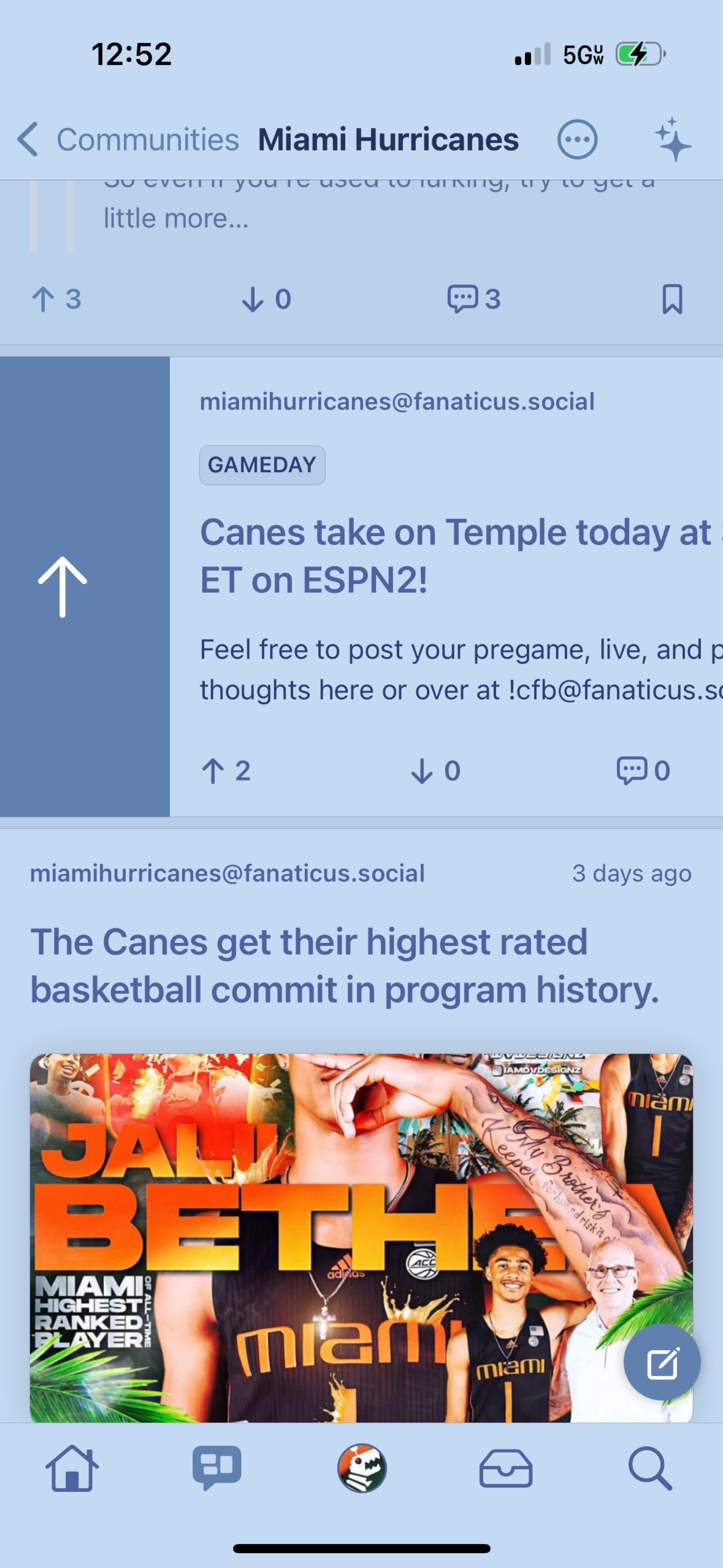
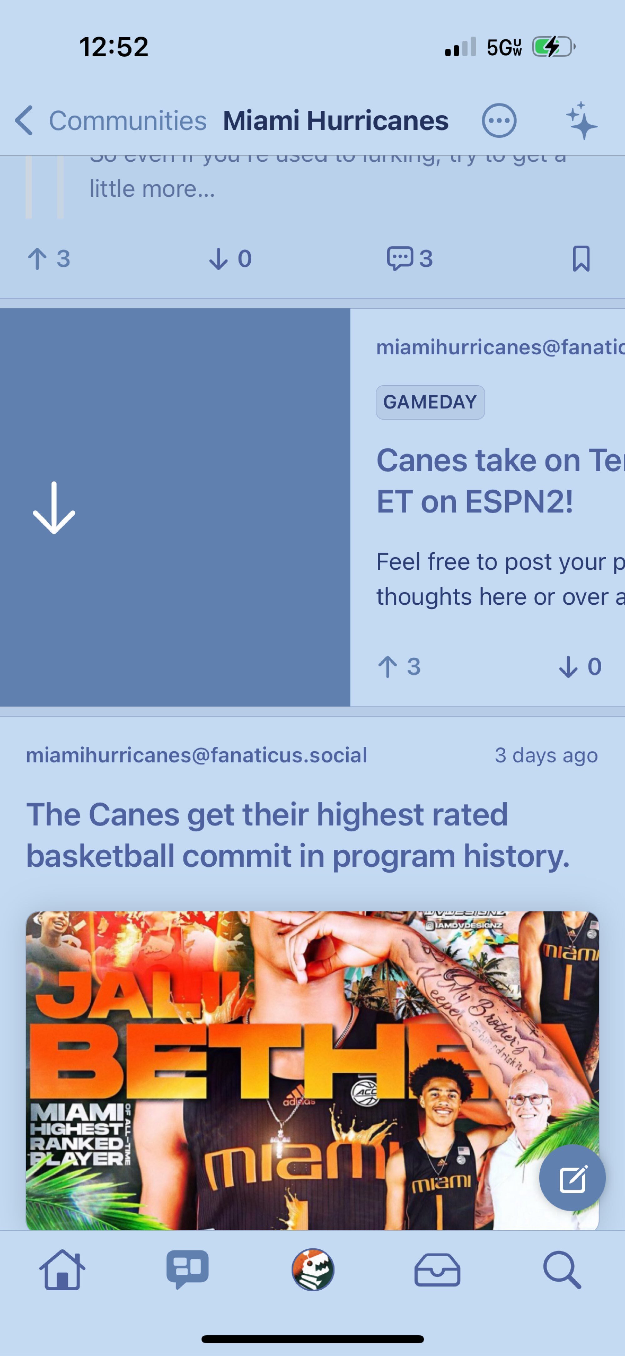
Oh yeah, that’s not great! I thought the monotone looked better than different colours but I think some different shades will work better.
I’ll fix in the next update along with some tweaks to the comment composer because some issues have arisen there too.
Don’t get me wrong. I’m still rocking the theme. It was just a thought I had.

