The next few items on the roadmap are all kind of small. I’m just going to try to knock as many of them down as I can before the next release!
Progress so far:
- Added support for clicking Lemmy links. Clicking on Lemmy links from within the app should open them within the app.
- When navigating back from post screen -> post feed, the post will be highlighted briefly to show where you were looking last on the screen.
- Added double press back to exit
- Tapping back from “Saved” or “History” screen will move to the “Home” screen instead of existing the app.
- Fixed a bug where tapping a post would cause it to appear 3 times in your history
- Fixed a bug where sentences are not auto capitalized in the comment editor
- Added swipe to go back gesture for the post screen.
- Refresh score of comment/post after vote is submitted to the server
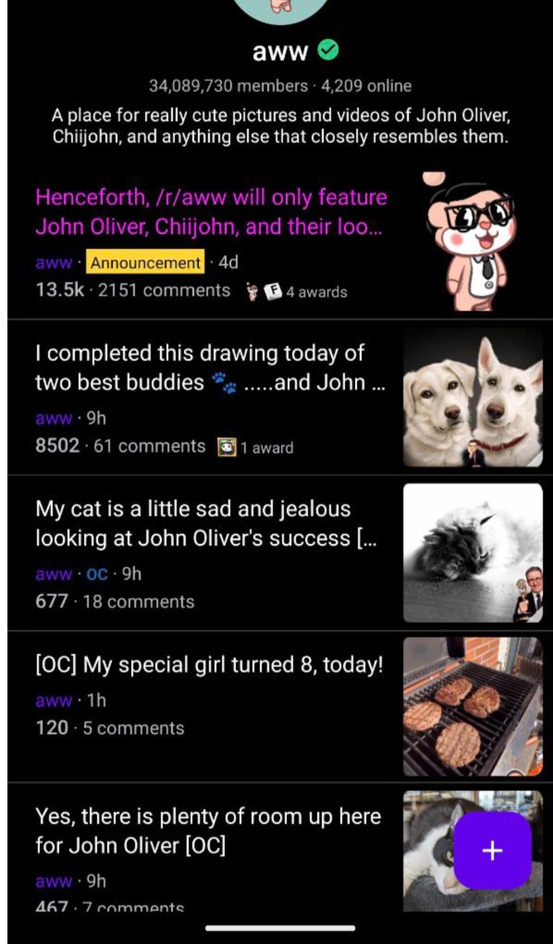
- Added layout where the content for posts is on the right hand side to make it easier for people browsing with larger phones
Update
I was initially going to get a release out tonight but swipe to go back literally took all night to implement (if swipe to go back wasn’t such an intuitive gesture I would probably have just stopped implementing it). I have work tomorrow so unfortunately I will not be able to make a release today. I’ll aim for a release tomorrow morning. Gnight!
Update2
A release early today is looking impossible. I’m super swamped at work and I noticed some bugs in the app during testing, so I would be unhappy with the state of the app had I released it right now. The release is going to have to wait until after work.
Update3
Release will be ready soon. ~1 hour?
Update4
Adding swipe to go back added so many bugs. Found some more testing the release. It should finally be ready now though… Releasing now. Should be live in the play store in a couple of hours.
Update5
Found a bad bug while the release was getting reviewed. Will have to bump to 0.1.11.
Thanks for keeping us updated!
deleted by creator
First comment with summit 😃
Swipe to go back is so annoying to implement. I’m on my 3rd implementation and I think I finally nailed it. There are so many possible interactions in the app already.
I tested Sync to see what their behavior is and even Sync doesn’t do well once it gets into some niche use cases. For instance launching subreddits from a post.
I think I’m ok with my implementation for now.
Only app where scrolling feels awesome. This app has potential to become one of top Lemmy apps(gives RIF app feeling). Compact and minimalistic. Keep it up.
Thank you!
Suggestions : I still have no idea how to initiate a post. I can only respond to existing posts. And how do I find my own comments to see if any one has responded?
Perhaps they are obvious, but not to me.
So far, I like Summit’s feel and layout the best, but I wish there was a RIF for Lemmy.
Unfortunately the answer to all of your questions is: that feature has not been added yet but it is on the roadmap. The app is still in it’s infancy so it will take some time before it has all the 😎 cool features.
Okay. I appreciate all your work, and since it’s my favorite, I’ll be patient.
( ͡° ͜ʖ ͡° )
Liking the app so far, is there any way to increase font size?
Unfortunately not at the moment (unless you count global system font size controls). I’ll add this to the app roadmap: https://lemmy.world/post/361855
Hi developer, I like history button. Thanks for this application. I want to say something. Always I’m seeing page1 top of the screen. Why it is there? Can you delete it?
The page number at the top shows what page you are currently on. It also allows you to tap it to jump to a previous page. I can add an option to disable it in the future, I’ll call it out in the roadmap post. I personally find it very useful to see how far you’ve “scrolled”.
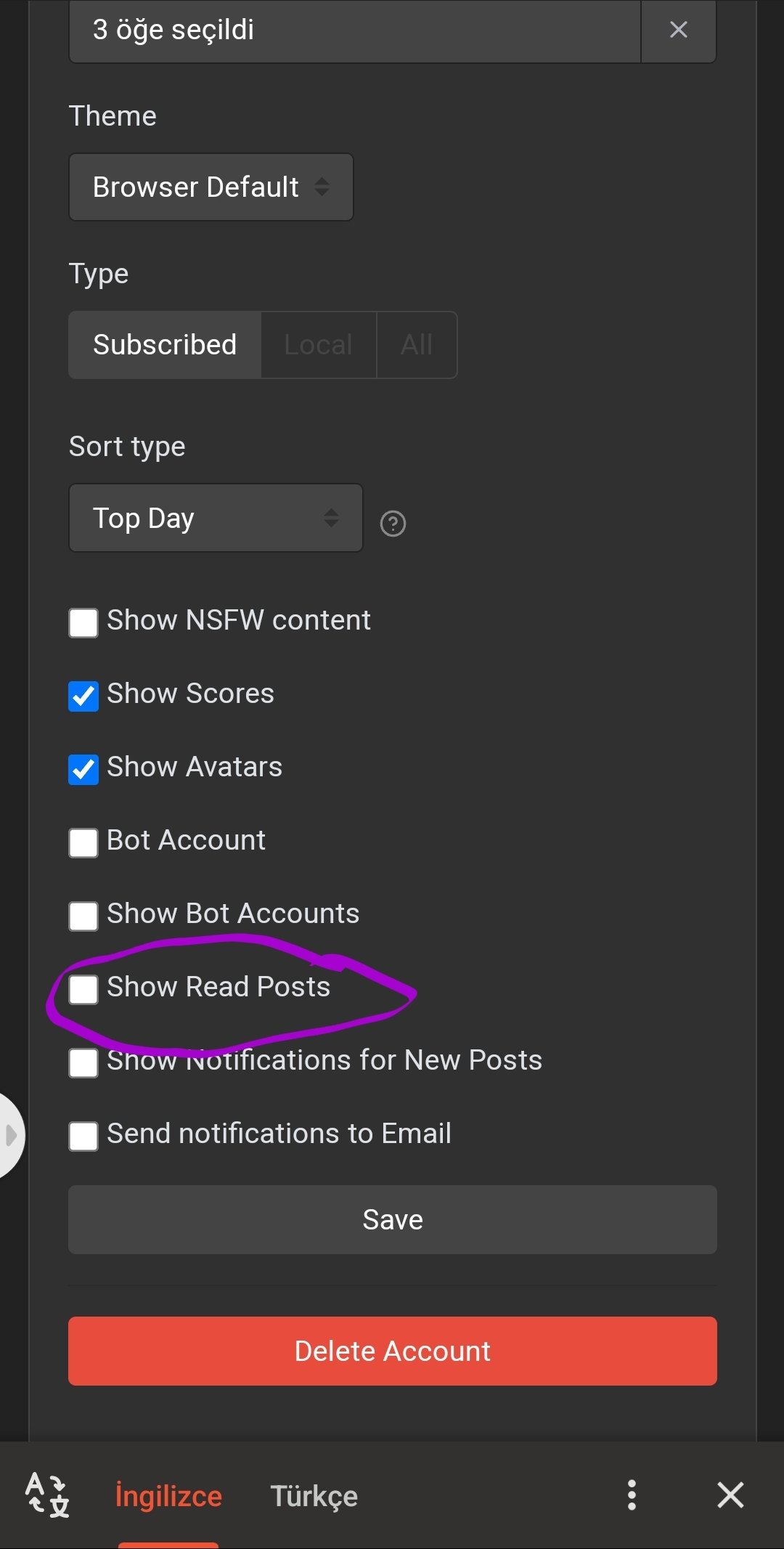
Can you add hide/show read option to road map. I think so many people want this.
Thank you for your feedback! I am not sure what “read options” are. Could you please give more context? Thanks!
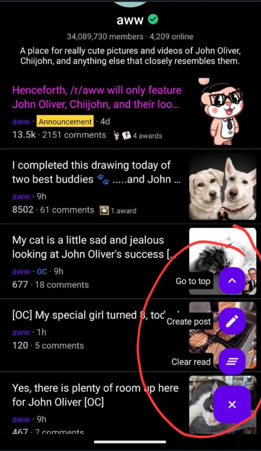
 there is a fab button. İf tou touch it you can see this
 This setting is already available on the Lemmy website

Thanks to this feature, you will not see the content you read repeatedly. It would be a clean interface.
Got it. I’ll add it to the roadmap.
This app is getting better every day, and still by far ahead of all others apps. I have 7 of them installed lol.
If I can just throw some suggestions, I would love a rework of most buttons into gestures:
-
Swipe left to vote like Relay for Reddit. I never used this when it was initially implemented but now it’s muscle memory, and having all the upvote/downvote buttons in the comments feels cluttered
-
Maybe you could replace the post-reply button with a full-width compose semi-textbox that actually opens the reply activity?
-
Also similar to Relay, I would really like sliding from the left to go back. I don’t need to open my list of communities from within a post
Some things not gesture related:
-
Auto-capitalize sentences in comments. Right now I need to manually press the shift button. I think it’s just a TextBox XML property so should be 30s of work
-
Option to refresh subscriptions, since my server (lemmy.ml) tends to have API errors due to being overloaded
-
Seeing upvote/downvote count update when I vote. Right now I have to reload the page first
-
The font seems hardcoded, is there a way to use the standard system font (Roboto)?
Once again, thanks a lot for the work, this app is by far my favourite one even without any of these suggestions! The performance is incredible, haven’t seen it drop a single frame
Morning! I just saw this comment. First of all thank you so much for the detailed feedback! I will try to address it the best that I can.
Swipe left to vote like Relay for Reddit. I never used this when it was initially implemented but now it’s muscle memory, and having all the upvote/downvote buttons in the comments feels cluttered
This one is tough. Not implementation wise but decision wise. The issue is this gesture would essentially make the community pane unusable. So this isn’t a decision of whether to add swipe to vote, it’s a decision of getting rid of the community pane in favor of swipe to vote. I think I’m just going to have to let this one stew for a bit before I make a final decision.
A bit offtopic but IMO one of the issues with adding too many gestures is the app loses it’s intuitiveness, when I think the biggest benefit of gestures is intuitiveness. When too many different gestures exist with no clear planning and reason, each gesture just ends up feeling kind of arbitrary. I think swipe to vote makes no sense from a intuitiveness standpoint but it is more of a “clean UI” solution.
Maybe you could replace the post-reply button with a full-width compose semi-textbox that actually opens the reply activity?
I assume you only mean to do this for the post otherwise if every comment had this, reading comments would be incredibly annoying. I don’t particularly like this idea because it uses a lot of screen space. I am however planning on adding a FAB (Floating Action Button) in the bottom right for common actions such as replying.
Also similar to Relay, I would really like sliding from the left to go back. I don’t need to open my list of communities from within a post
This is already planned. The currently plan is I will try to implement this after work. If it takes me longer than a day I might have to move it to the roadmap since currently this isn’t a “core feature”. The main challenge with this one will be performance. Swipe back gesture is fine but the issue will be to keep around the back screen (the posts screen) so a preview of it can be shown when you slide. I’ll be keeping performance in mind while I implement this.
Auto-capitalize sentences in comments. Right now I need to manually press the shift button. I think it’s just a TextBox XML property so should be 30s of work
Thank you for reporting this. This will be fixed in the next update. This is a bug I missed during testing because I use an emulator to test 95% of the time. On an emulator I just used my keyboard to type comments.
Option to refresh subscriptions, since my server (lemmy.ml) tends to have API errors due to being overloaded
I noticed this sometimes. The issue is rare from my experience so I never prioritized fixing it, but I can try to see if I can fix it for next update.
I agree with your current decision right now regarding swipe to upvote. It seems unintuitive to me and with how tall my phone is, I assume there’s going to be a lot of mistake upvotes. I’ve tried another app with multiple actions that are triggered by varying degrees of swiping and it I would have to consciously control my swipes which seems harder than simply pressing a button.
I use both current gestures to the left and right and the community pane is pretty important. If anything, it allows easier access to rules or info for reference. I would like this to stay the same though I can suggest adding the community pane through the three dots/hamburger menu at the top like my previous reddit app.
Seeing upvote/downvote count update when I vote. Right now I have to reload the page first
This is a known bug. I will try to get a fix for the next update.
The font seems hardcoded, is there a way to use the standard system font (Roboto)?
There is no way to change the font at the moment. I’ll add it to the roadmap under settings. The app currently uses the system default font. On my test devices the default font is Roboto. If you are using a weird device with custom fonts it might not be Roboto.
-
deleted by creator
deleted by creator
deleted by creator
deleted by creator


