All the apps make it very difficult to create a post. You have to know what community you will be posting to, search for the community, click the three dots, click create post, click whether it’s a photo/link/text and then start posting.
Why not just have a Create Post button with the title field, url field, body text field, and a button to upload a photo and then a choose community button
Very easy from Sync too. Questioning this “all the apps” and “very difficult” business.
Jerboa’s create button “+” is actually obnoxiously big on the front page. I should be able to hide it. It give the fields title, url, body, community, and nsfw toggle.
Jerboa has pretty much exactly that
Liftoff also has a create post button with exactly that.
You say “all the apps” but I’ve tried a fair number of Lemmy apps and they’ve all had some form of “create post” button except maybe some very early alpha releases.
Came here to say this
Eternity has a big plus icon in the bottom right corner, doesn’t get much simpler than that
Boost has HUGE + , always visible. What are you blabbering about?
Connect has pretty much exactly that
After you click the green plus (+) in Jerboa, then you’ll be presented with this screen featuring everything you asked for:
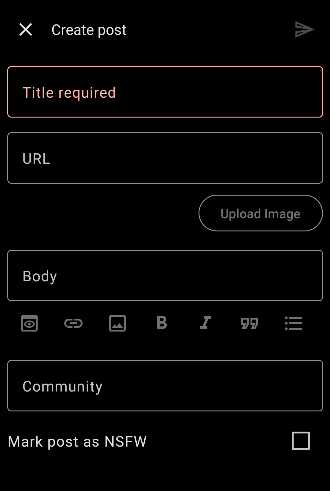
The submit button is the paper airplane in the top right.
They do. In the most recognizable format ever. Are you missing something?
Not on the title bar, but Liftoff has a really big button with plus sign on it. Hard to miss.
Overall the app has a great UI.
E: It may have sounded like I was sarcastic, I was not.
In Sync, it’s the “Submit” option in the … menu of the feed.
Majority are very Reddit app like where it’s exactly as you described and that would be why. There wasn’t a general post button. You always posted within the subreddit, at least in all the ones I used.
Umm? The ‘+’ button on Connect is exactly that.
Does the name mean something? Its quite hard to remember and spell. Looks great though
Thanks! And I wanted a fun name that was short (which is difficult since domains are expensive!)
Also, I was later told that the “Quibbler” is a magazine in Harry Potter 😂 so I guess it’s fitting in a sense
deleted by creator
Liftoff and Connect both have a simple post button…


