

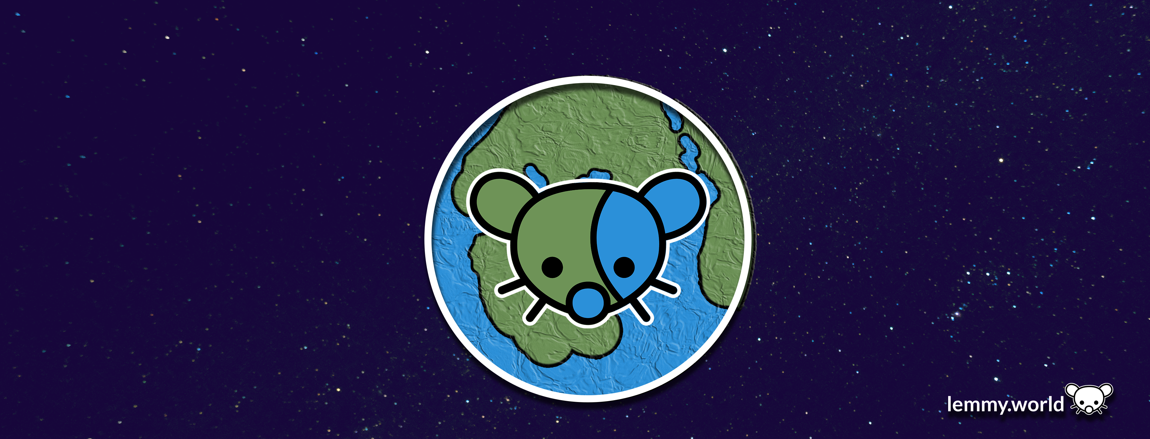
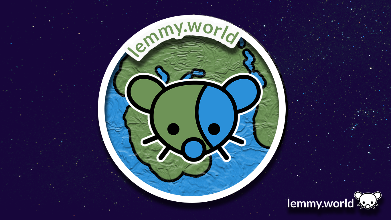
Here are some proposed graphics.


EDIT: I’ve now made a repository on GitHub, so that you can download the graphics and use them for your communities and projects. There’s even an Etsy store selling stickers now.

Biblically accurate lemmy
That’s pretty sweet! Nice work
Thanks :3 OP did most of the work .
Stable Diffusion?
It’s the underlying tech in the open source AI image generation that started the explosion over the passed 6 months or so. If you want to play with it here’s a link to a community driven resource: https://aqualxx.github.io/stable-ui/
A bit overwhelming on the eyes. But that’s only a personal opinion.
skeuomorphism go brrr
lol nice u/n. Also, thanks for the word. Haven’t heard it before and I’m a fan :D
Try making the left ear blue and the right one green.
Swapped.
Thoughts?

deleted by creator
Definitely better!
Looks great! ❤️
Yeah, otherwise the lemming’s face is camouflaged.
Agreed, that would look much better!
The bottom two would make a nice favicon on my bookmarks bar!
Just wait until Ruud turns on custom emojis! Then we will really be cooking with gas.
As a bit of a post script, I also made graphics for the Mastodon.world instance. So if these look familiar, well, it’s because they are familiar! Thank you have having me here, Ruud, and to the whole Administrator team!
website seems to be down
Oh dear. That’s concerning. I’m… going to go check on my hosting.
You: Which one do you like?
Me: Yes.
I made this 16x16 favicon (CC0 license)

🥹❤️
deleted by creator
Oh, what a wonderful addition! That’s a cutey if I’ve ever seen one @[email protected]!
Are you working with the site admins to include this? It will require scaling the png to 25% size, and a line of HTML:
<link rel="icon" type="image/png" href="whatever.png" sizes="16x16">
The first is by far the best. A logo is not a name tag. You don’t need to have lemmy.world written in it.
I guess if there were to be a banner, then #1 would be nice.
But for the logo I’d prefer #4
Idk I like the design but the plastic wrap filter in the planet makes it seem too busy
The bottom ones. Remind me of Braveheart 😃

“They may take our third party apps…”
These are great!
My best idea for a logo was the lemming-gerbil humping the shit out of a planet. It was… not a good idea.
deleted by creator
Nice. These should be the defaults.
Yeah any of these are honestly better than the current one.
I love it
Both 1 & 2 look better on a web browser but on mobile the globe has a weird texture look to it. I like #1 as a banner and #5 for the icon. I will say I also like the current icon.


