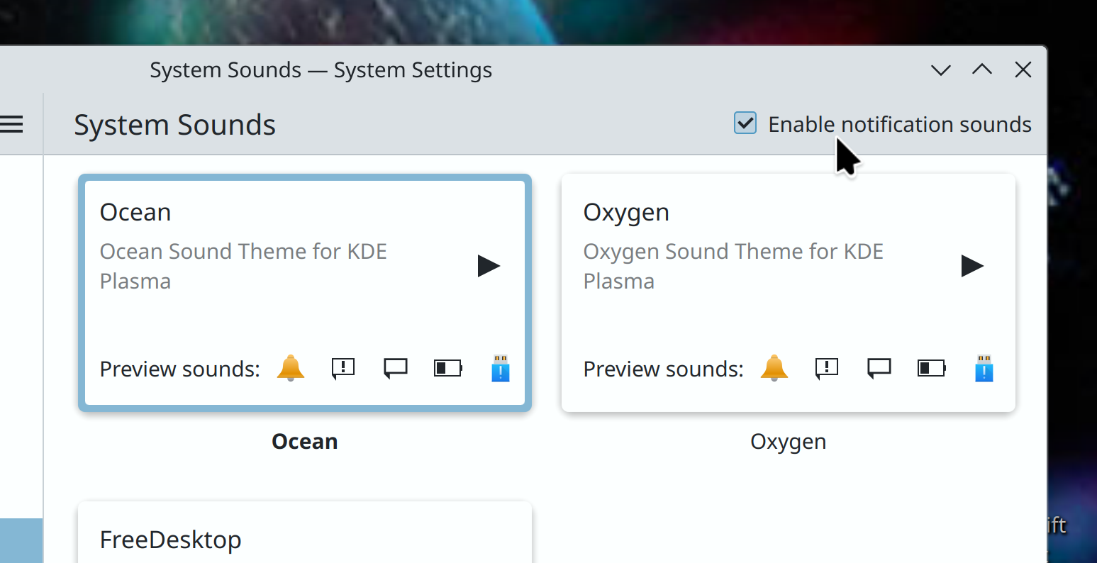
The double-click speed setting returns, and now lives on System Settings’ General Behavior page. Before you ask why it’s not on the mouse Page, it’s because it affects touchpads too and that has its own page, and duplicating the setting on both pages seemed messy and ugly
As long as the value is synced, I can’t imagine how it would be bad to have in both pages; especially since that’s where a user would expect to see it.
There’s nothing wrong with multiple ways to find a common setting
I think the best solution is to have a… Link? To the general setting.
Having duplicated settings across multiple settings page is something that I think is an issue. Cause it isn’t obvious to the user if the setting is actually shared between the two pages or if it has two different options with the same name. It also doubles cognitive load to the user, as if they have a Touchpad and Mouse they need to remember both pages have the same setting.
A link is more of a way for the designers to tell the user “Hey, we know what you are trying to find, but it is in another place”
Absolutely agreed. The equivalent of "Can’t have application shortcuts, you can already find the executables in the file browser* type nonsense IMHO
I would much rather have it in two places where a user would expect it than 1 place a user wouldn’t…
no more frames within frames! Instead Breeze-themed apps adopt the clean design of modern Kirigami apps, with views separated from one another with single-pixel lines!
Does this talk about that little blue square that is inside of dolphin where the folders reside?
Yes but not only. Various other components inherit from QFrame and had by default a frame.
Man, that little square drives me nuts. I never understood why it was there in the first place. lol
I like the blue square, it’s pretty :3 But I’ll learn to live without
deleted by creator
Maybe it’s not displayed by default. Customizing toolbars should still be possible.
I would agree with that decision - Dolphin handles tabs very well and if the need ever arises for something like split view, I just hit ctrl + T. Feels more natural to me.
They didn’t, whoever took the screenshot just doesn’t have that button on their toolbar.
A huge issue I see is that it feels like Dolphin has memory issues at the moment. I get permanent background crashes for no specific reason (already reported).
And rewriting apps in Rust is not existent for Qt, as it uses C++ a lot as far as I understood.
I dont like the design of GTK, even though its more modern in a way, but there are already lots of GTK apps in Rust.
Somehow I think KDE is a bit doomed here. Its Qt or a complete rewrite which will not happen.
Do you know more about this? A big part also is that I often hear young Devs dont learn C and C++ anymore, but maybe prefer Rust if any low level language.
I love KDEs features, and I am very excited for Plasma 6, which will hopefully be a lot more stable and cleaned up!
I’m all for some good old Rust evangelism, but I think it’s a bit of a stretch to claim that KDE is "doomed"in the absence of a migration path to Rust, and it’s not obvious to me that moving to Rust is somehow a necessity for the long-term viability of a project.
To your point about young devs and C/C++, afaik C is still pretty standard curriculum for CS degrees at most colleges and universities. C++ maybe not so much, but I would argue that it actually has a shallower learning curve than Rust. IMO the STL is a lot easier to get a grasp on as a newer developer than Rust’s borrow checker or lifetime system.
IMO the STL is a lot easier to get a grasp on as a newer developer than Rust’s borrow checker or lifetime system.
I actually feel like Rust’s borrow checker is more difficult to learn for experienced devs. We’ve got a trainee in Rust and for her, it’s just a normal thing that variable slots hold ownership and can lend it and get it back. She does sometimes still struggle with when to clone and when to borrow, but she’s getting there.
As for the lifetime system, no one on our team really gets that one. 🙃
But (that’s because) you rarely need it.


