- cross-posted to:
- games
- cross-posted to:
- games
You must log in or register to comment.
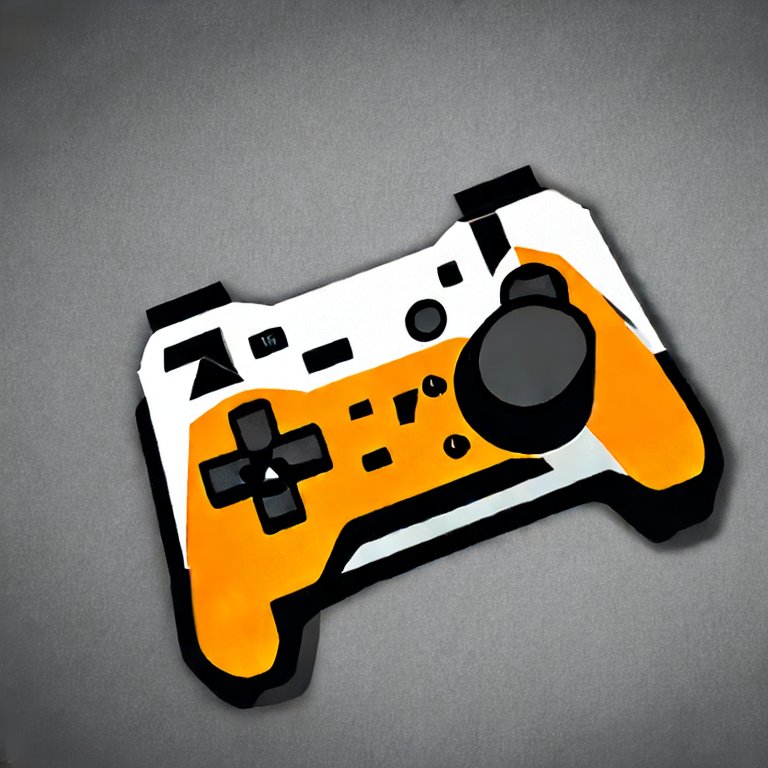
This is a decent way to simplify a logo, actually. The font is pretty underwhelming tho
Reminds me of reading the article “why do everyone’s logo fonts look the same” recently on hacker news


