
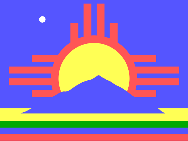
June 13 seems like a slow day in the history of vexillology, but at least there’s this flag.
Info: https://www.roswell-usa.com/city/flag.htm
And yes, it’s a UFO in the top left corner.
You must log in or register to comment.
I’d definitely wear this on a T-shirt, but is it a bit too intricate for a flag?
Yeah, a bit too much. I think it looks quite nice overall, but they should probably cut away a bottom stripe or two. And the non-triangular and non-centered mountain is border-line criminal. But it’s not super evident and you would probably not notice that when waving.
I agree on the bottoms stripes. The colors are a bit much for me but to each their own
!wave
Here you go: Link
Beep Boop I’m a bot. Maintained by Thomas Douwes
Did I get something wrong? if so please message @[email protected]Good bot!
Also, have a look at the city seal:
 .
.That’s a cool adaptation of the NM flag.