
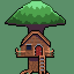
Don’t think it’s as good as the things you guys have been posting, but figured I’d throw it out here anyway since it’s something I’m kind of proud of. And hey, gets a bit more activity here.
Let me know what you think!
You must log in or register to comment.
I love small icons like these. The very minimal stones is a super nice touch too. Not a dig, but I wonder why you chose very desaturated colors? I guess usually people into pokemon choose very vibrant things.
Thanks!
I think all of my art at the time did, not really sure why. I think I wasn’t that happy about how I did shading, so I got in a bad habit of choosing low contrast colours to try and “hide” it. I do think if I did it nowadays, I’d try and be bolder with selecting colours.

![[OC] Going through old pixel art, and figured I'd throw this up](https://beehaw.org/pictrs/image/6df218d3-3bf3-41e8-a9e6-d742737a3326.png)