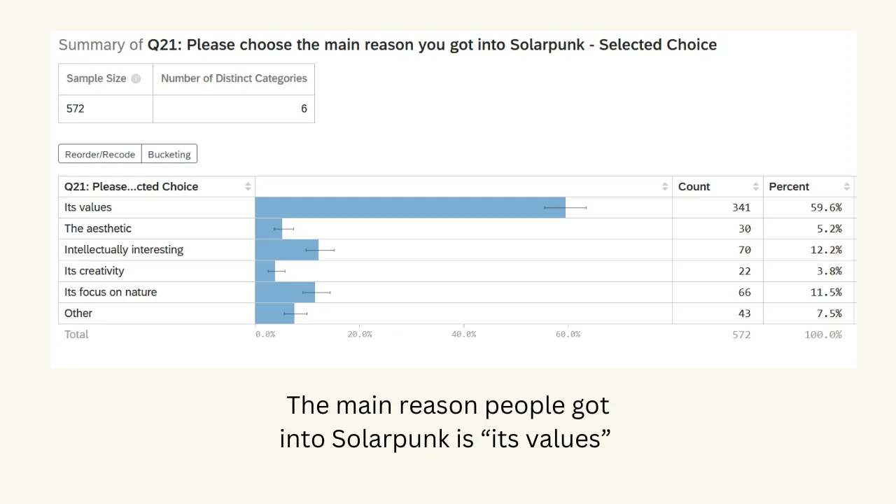
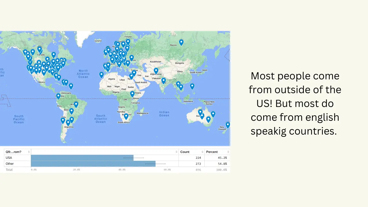
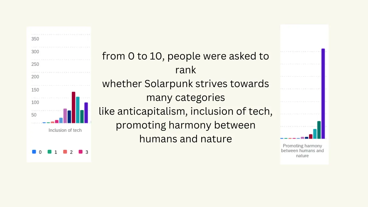
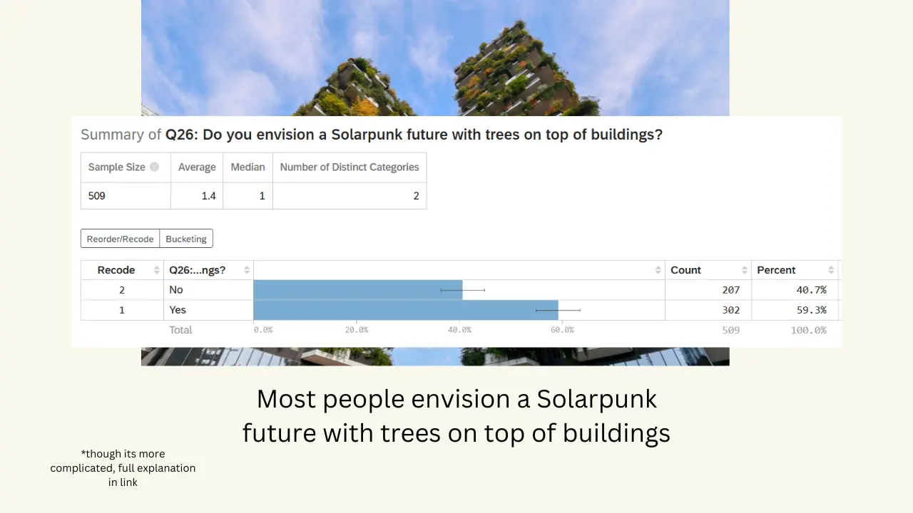
Hi everyone! A bit over a month ago I made a survey about Solarpunk and shared it here. Now, I finally present you the findings of the survey! I am adding a few pics here for a preview and if you are interested, go check the link where there is a full description of the findings!!
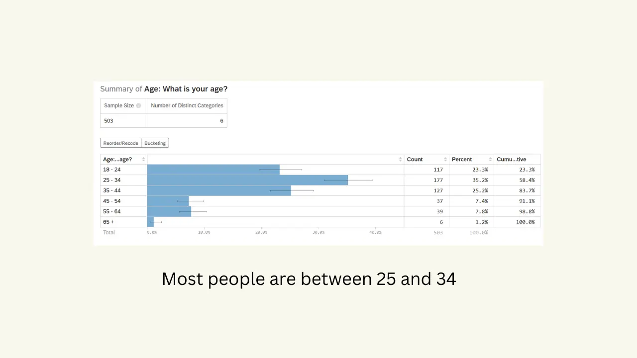
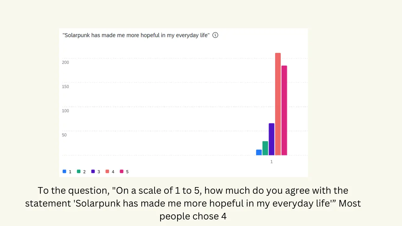
full findings: https://thesolarpunksurvey2024.carrd.co/


imo it is better to make simple websites that don’t use too many animations. Otherwise they don’t display properly on some devices. Here’s what it looks like to me:
As you can see, the picture doesn’t show completely (the borders are cut off), also the photo fades in rather slowly, which is annoying when scrolling through quickly.