AnIDFB to [email protected]English • 2 years agoWhat's up with this gigantic gap?lemm.eeimagemessage-square4fedilinkarrow-up110arrow-down18
arrow-up12arrow-down1imageWhat's up with this gigantic gap?lemm.eeAnIDFB to [email protected]English • 2 years agomessage-square4fedilink
minus-squareMax-PlinkfedilinkEnglish2•2 years agoBecause the vote count and timestamp is aligned to the right, while the username, tags and links are left aligned. Maybe it’s clearer in landscape orientation:
Why is there a gap at all?
Because the vote count and timestamp is aligned to the right, while the username, tags and links are left aligned.
Maybe it’s clearer in landscape orientation:
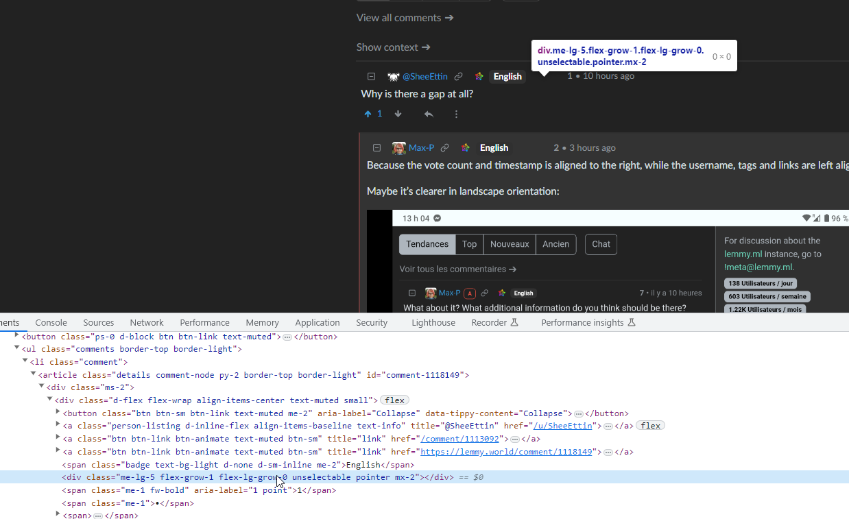
No, there’s an empty div.