

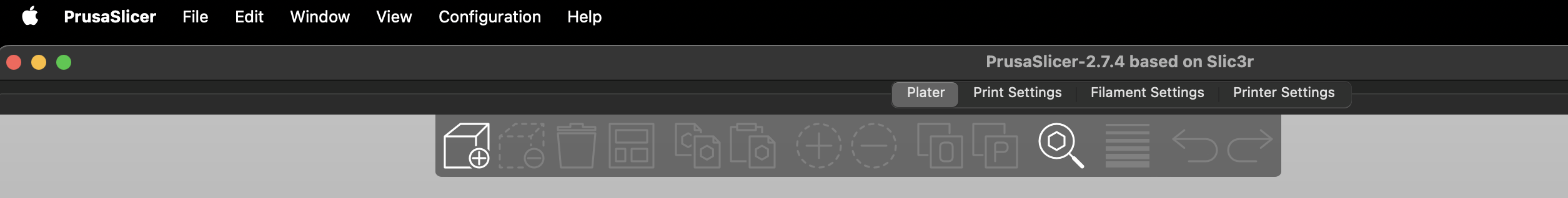
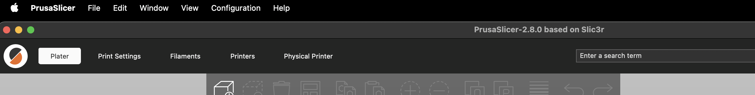
Screenshots of the UI changes on the Mac - in my opinion it is now just wasting a lot of screen estate for zero benefit.
On non-Macs they’re adding an extra usability issue by hiding the top menu bar. I’ve gove back to 2.7.4 for now - fortunately I had my configuration in git.
Up to 2.7.4:
2.8.4:
Does Apple lack a feature to turn off or hide the file menu?
I don’t recall if I custom bound mine or if GNOME defaults to, but I never see those old things unless I press F10.
I agree that it is not very pretty having all three of those bars in growing redundant nonsense. Tiling frames are like desktop icons IMO; very retirement-center historical-preservation aesthetic design, but we’re talking about desktop environments at that point, not the app dev. Apple wants things to be their little aesthetic way to monopolize, so they intentionally make decisions that erode the usefulness of outside package standards.
I have no idea. They decided to put a notch with the webcam in the middle of the screen, so I’d not be able to use that space properly with anything else anyway.
My point here wasn’t about mac, though (it was just handy for doing the screenshot at this moment , though it’s my least used platform for this: I had it upgraded, and as I have no intention of upgrading it on my Linux system after that experience I made the screenshot before the downgrade) - my point was the needless waste of space in the newer PrusaSlicer, which applies on all platforms.
To my knowledge the only way to “turn off” the menu bar is to run a program in full screen mode on a mac.