

- cross-posted to:
- [email protected]
- cross-posted to:
- [email protected]
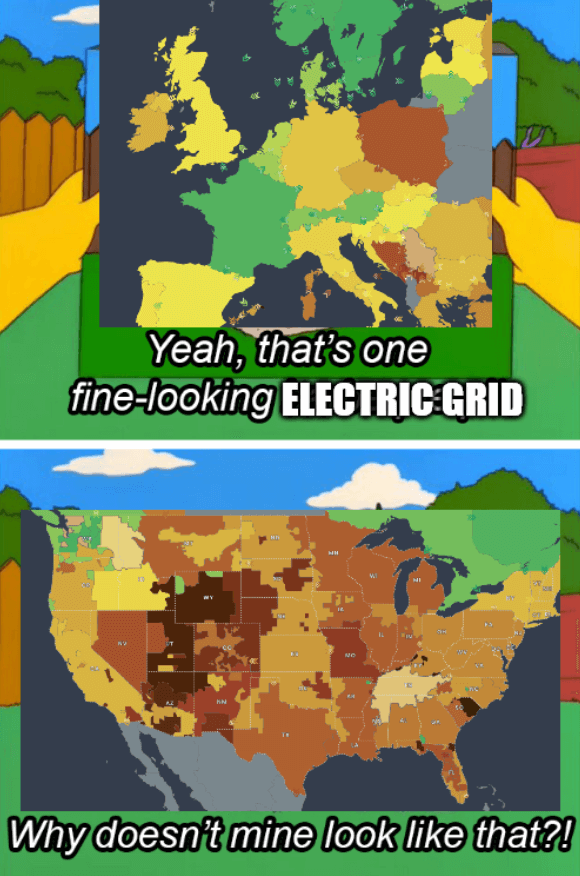
Source - The colors of the grids represent CO2 emissions
The title is a reference to the 2021 Texas power crisis
Source - The colors of the grids represent CO2 emissions
The title is a reference to the 2021 Texas power crisis
The map is just bad? They’re throwing large groups of states together that have literally no control over what other states do. For instance, it groups part of North Dakota, Minnesota, Wisconsin, Iowa, and Illinois together as if they’re one giant blob and then saying they’re only 10% renewable and 31% “low carbon” (whatever that means).
A quick look at Illinois shows it’s 55% nuclear and 21.6% renewables for a grand total of 76% of their power being carbon free. Minnesota is 41% renewable, 25.3% nuclear, for a grand total of 66% carbon free electricity. Iowa is 90% (!!!) renewables. Even Wisconsin is 20% nuclear and 15.6% renewables.
https://www.eia.gov/state/data.php?sid=MN
https://www.eia.gov/state/data.php?sid=IL
https://www.eia.gov/state/data.php?sid=WI
https://www.eia.gov/state/data.php?sid=IA
However this map is being generated, it appears to be absolute garbage and intentionally skewed, and isn’t basing any of this on any logic. It can’t be based on population served or on size of ground covered.
I believe it goes by county.
what is it even trying to demonstrate? Doesn’t the US have three primary grids? The east, west, and texas?
Surely this is wrong? I guess the idea is to demonstate across state/country lines, but like, why? Who cares!
They’re based on the grid operators in these regions I think, but it still looks incorrect to me.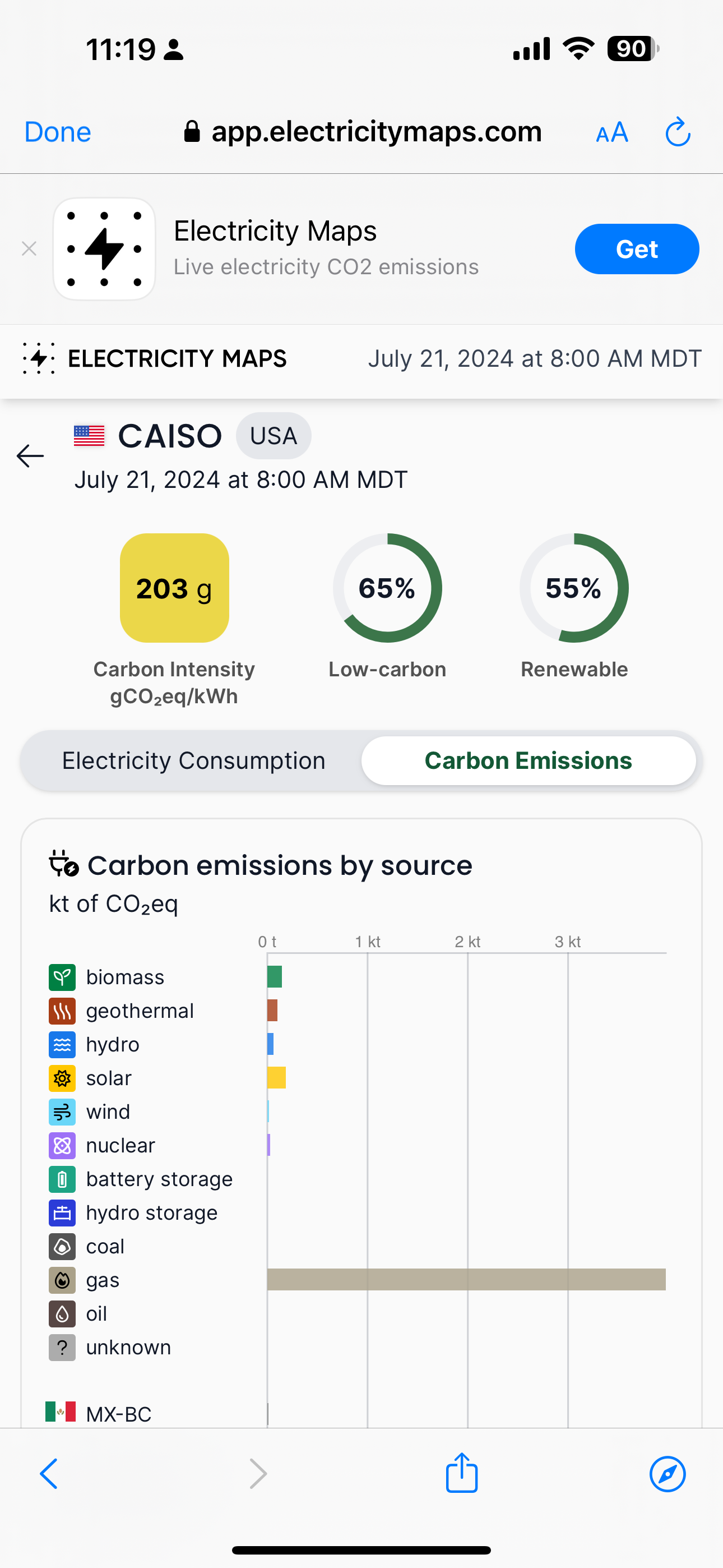
And Colorado has a significant amount of renewables as well so something is really off with the numbers here.