\[top-down view, geometric shapes vibrant coloured, (grass green background:0.2)  :  : 0.2\]
\[ \[ : (city:1.3) : 0.2\] : : 0.6\]
\[ : anime, cyberpunk city : 0.6 \]
top-down
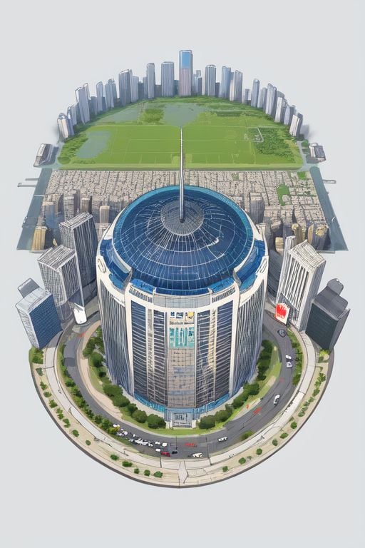
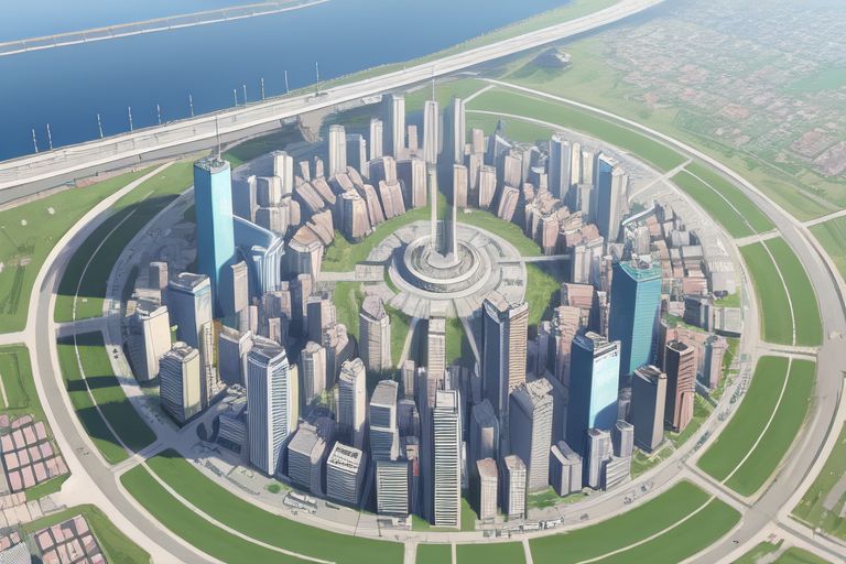
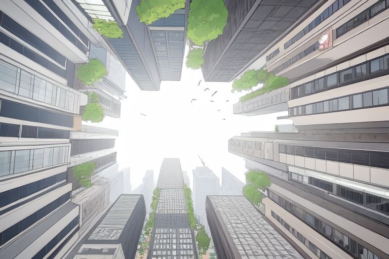
To explain, the first line uses the prompt top-down view, geometric shapes vibrant coloured, (grass green background:0.2) for the first 20% of steps. The general shapes/colours are established.
The second line, (city:1.3) is the prompt from 20% to 60% of steps. Transformed into a city based on those shapes.
The third line, anime, cyberpunk city is the prompt from 60% to the end. A layer of style added on top.
Outside any of that, the last line top-down is always tagged onto the end to try to keep the view stable.
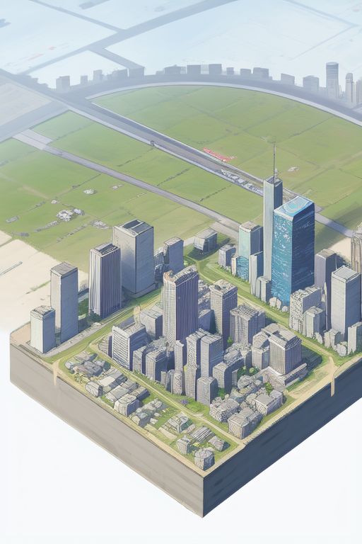
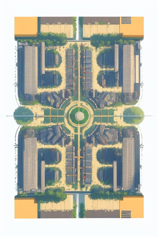
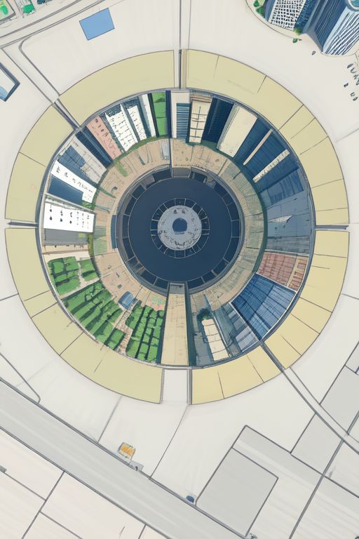
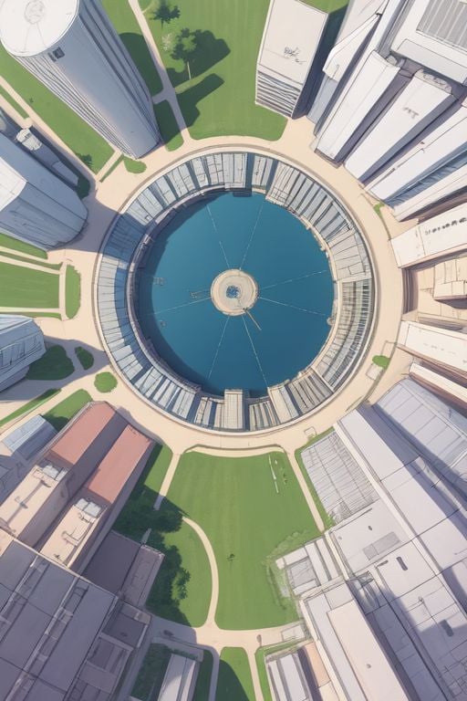
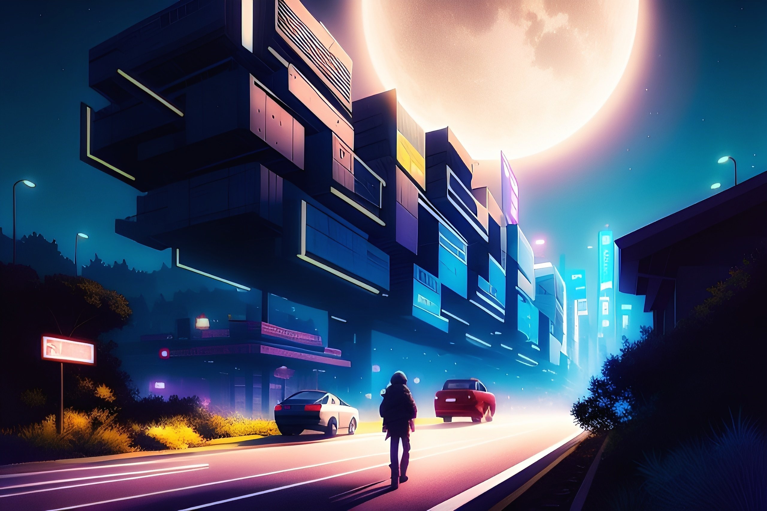
Probably should have started with a simple example, but…
\[(concentric ripples:1.7): (moebius:1.3): 0.4\]This overweighting thing, if you can dial it in so you get the style you want… is essentially nothing like the term you’re weighting. So it’s like it makes this whole new style, this whole new genre of image.