@UnderpantsWeevil to Lemmy ShitpostEnglish • 7 months agoIrish Journalist Excellenceimagemessage-square27arrow-up1414arrow-down16
arrow-up1408arrow-down1imageIrish Journalist Excellence@UnderpantsWeevil to Lemmy ShitpostEnglish • 7 months agomessage-square27
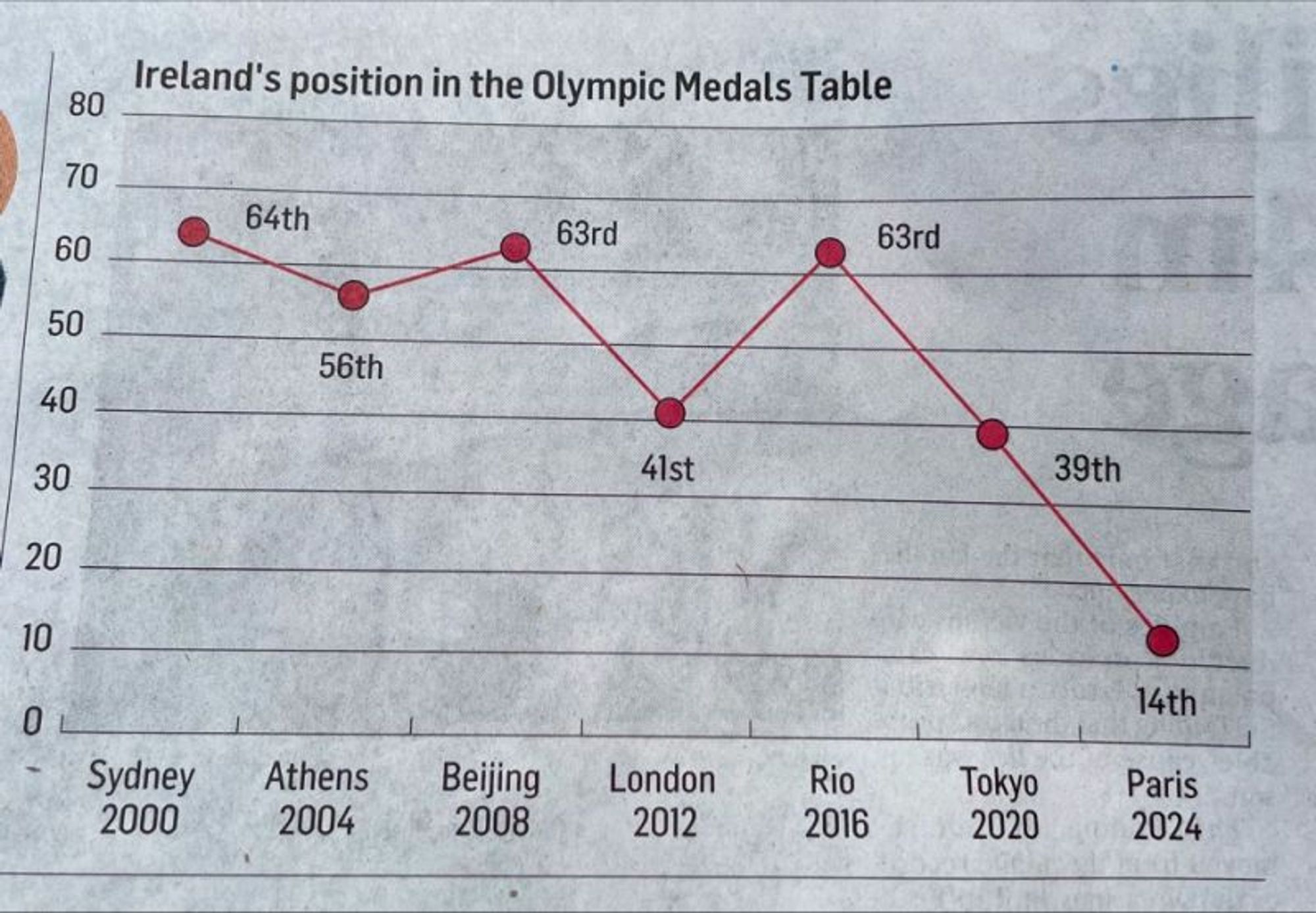
minus-square@the_toast_is_gonelink11•7 months agoThis reminds me of that chart showing gun deaths over a few years that showed the line going down the more deaths there were. That made sense graphically, they colored it in to look like blood dripping down, but this is just dumb.


This reminds me of that chart showing gun deaths over a few years that showed the line going down the more deaths there were. That made sense graphically, they colored it in to look like blood dripping down, but this is just dumb.