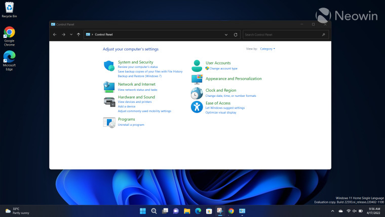
After mulling over it for close to 14 years, it seems Microsoft is finally ready to kill off the Windows Control Panel soon. An official confirmation has been posted on its website.
Their settings pages are the worst; full of white space, finding what they considered “advanced” settings is usually a pain in the ass, and everything is dumbed down to a mind-numbing extent.
I’ve hated Settings pages with a passion since they were introduced, and always typed the full .msc I was looking for.
I really hate that you can only open one settings page at a time. There is no justification to making you lose your place you’re working on just because you want to adjust another minor setting. With the old interface I can e.g. have network and sound settings open at the same time and I don’t know why they took that away.
the loss of info density in favor of making everything fingerable has been one of the worst things to happen to anyone slightly inclined at managing systems. i hate trying to manage things in a touch based UI. so much fucking scrolling and wasted space. it does look nice , but fuck is it a productivity killer.
I also dislike the design layout. Eg. I much prefer the control panel version of Disk Management than the settings purely from an aesthetics stand point. Each disk and their partitions are just easier to see and differentiate from others.


Their settings pages are the worst; full of white space, finding what they considered “advanced” settings is usually a pain in the ass, and everything is dumbed down to a mind-numbing extent.
I’ve hated Settings pages with a passion since they were introduced, and always typed the full .msc I was looking for.
I really hate that you can only open one settings page at a time. There is no justification to making you lose your place you’re working on just because you want to adjust another minor setting. With the old interface I can e.g. have network and sound settings open at the same time and I don’t know why they took that away.
I have been able to live with everything else, but this is the one that kills me every time.
the loss of info density in favor of making everything fingerable has been one of the worst things to happen to anyone slightly inclined at managing systems. i hate trying to manage things in a touch based UI. so much fucking scrolling and wasted space. it does look nice , but fuck is it a productivity killer.
I also dislike the design layout. Eg. I much prefer the control panel version of Disk Management than the settings purely from an aesthetics stand point. Each disk and their partitions are just easier to see and differentiate from others.